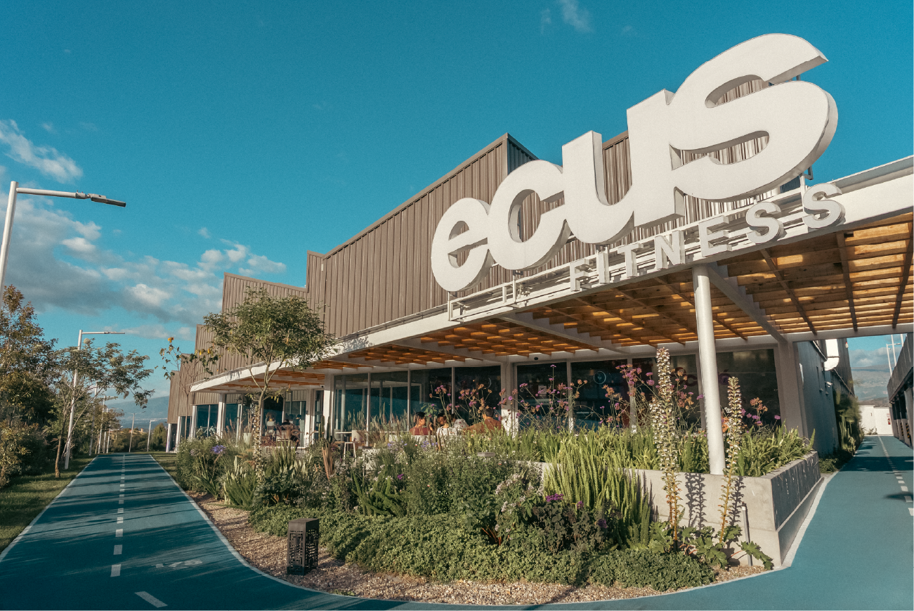
The largest and most modern gym in Ecuador.
The name Ecus comes from the Latin "oecus," a large Roman hall where people gathered, and from the word "echo," something that repeats. Ecus is a place where we build habits as a community, where well-being lasts because we repeat it every day.
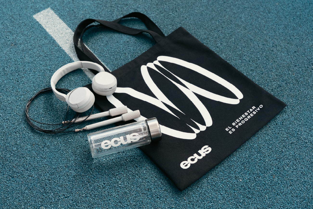
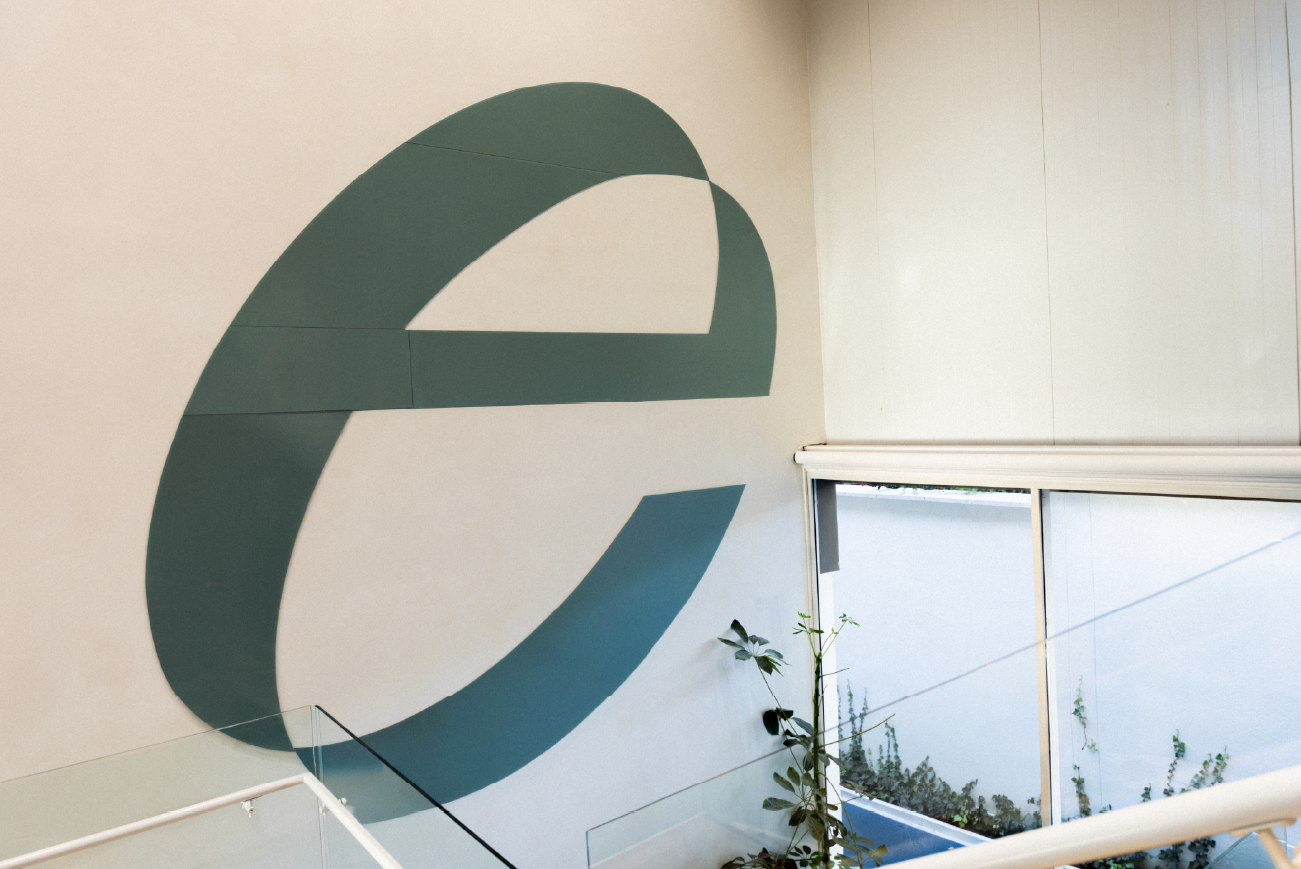
For the logo, we took a typeface and treated it so that the outer silhouette of the letters creates contours reminiscent of a circle. We wanted something simple that could easily adapt to formats as varied as a guest wristband or the building's signage. Since the name is so short, there was no need to create additional logo adaptations.
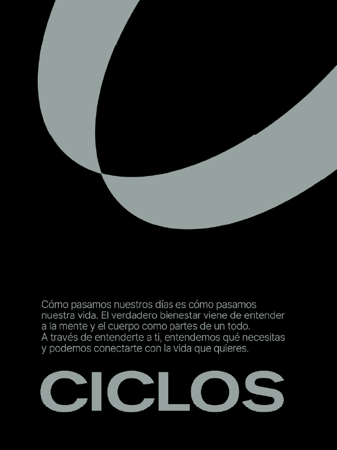
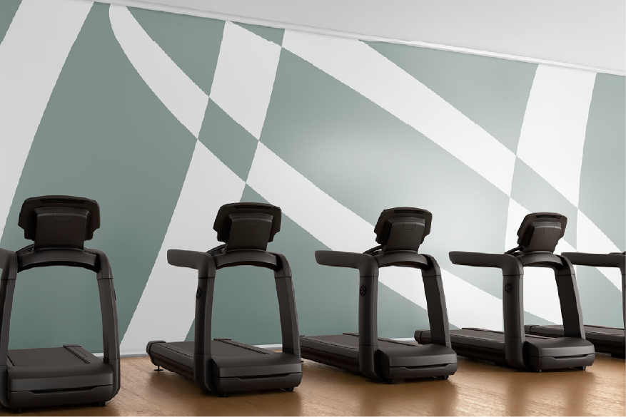
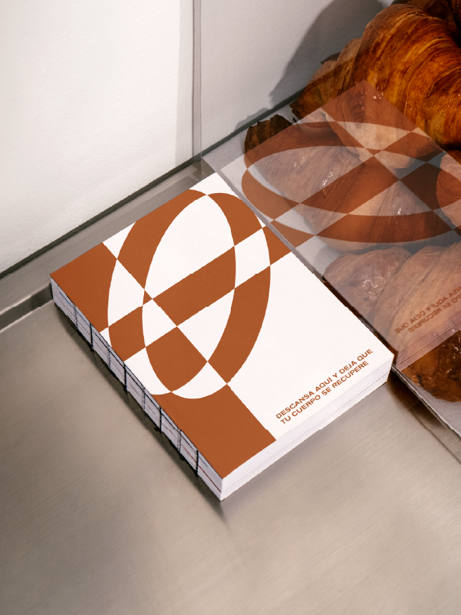
The graphic assets for Ecus are symbols of the cycle—circles that repeat, shrink, expand, and move to create dynamism for the brand. The primary color for Ecus is a very soft greenish-gray, strategically chosen to create a sense of well-being and to stand out from the competition, where red, orange, and black predominate.
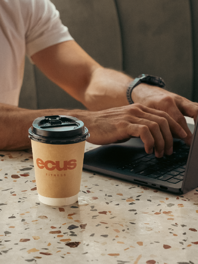
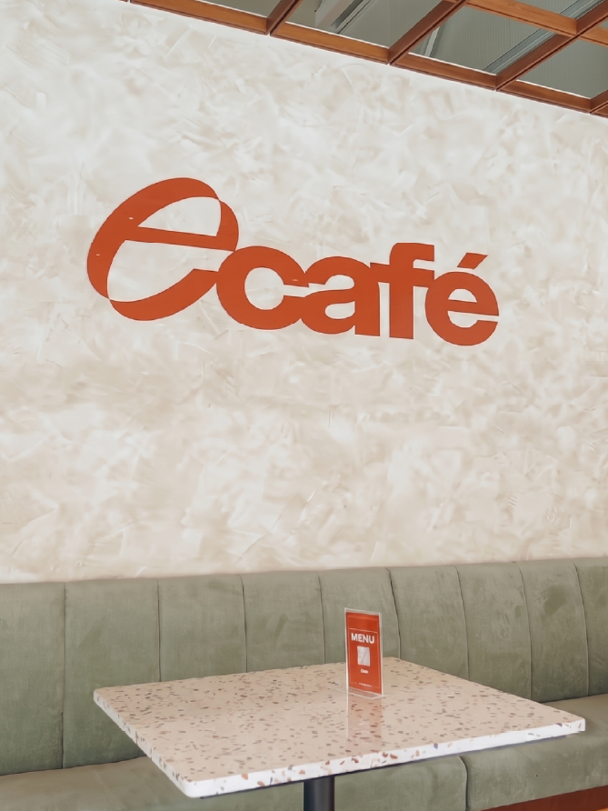
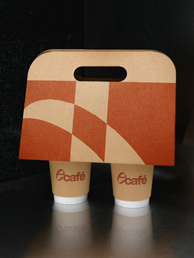
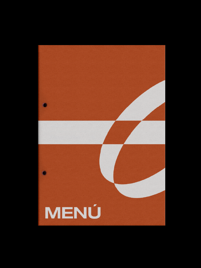
For the café (Ecafé), we used the same elements as the parent brand but changed the primary color to a contrasting orange. This gives the sub-brand a distinct personality while ensuring it is understood as part of Ecus.