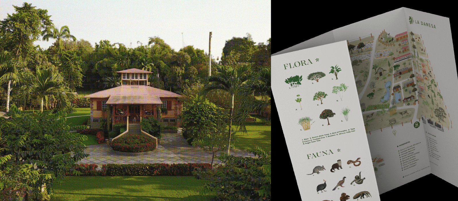
A family-run working farm and estate in Naranjito offering luxury agritourism stays and experiences.
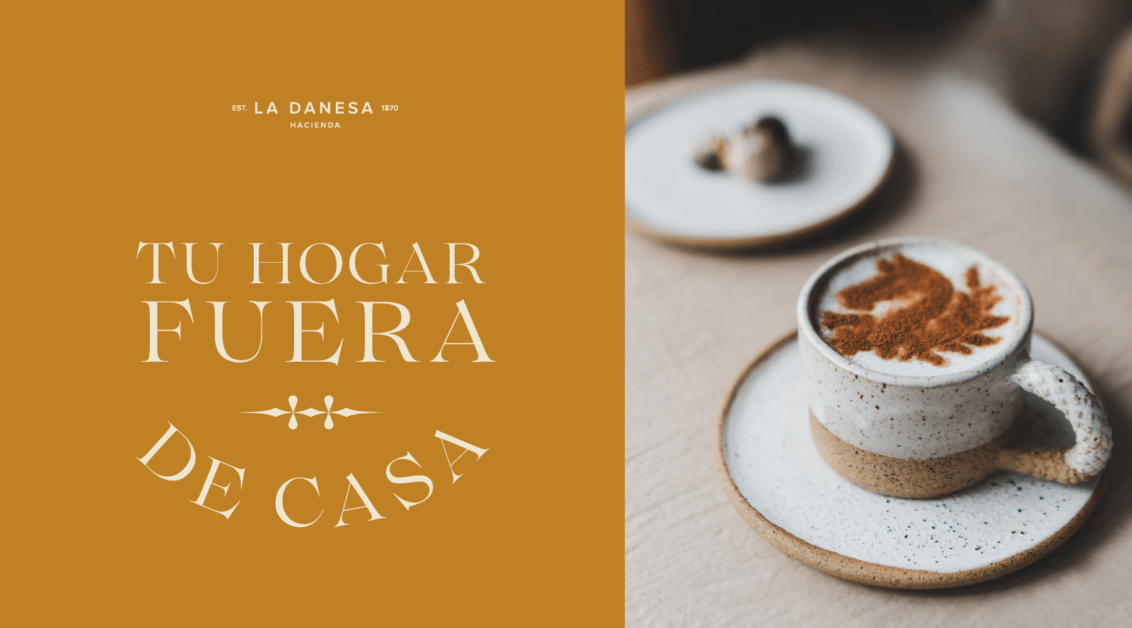
We created a brand that showcases the legacy and tradition upon which La Danesa is built, while also reflecting the bold creativity with which it looks toward the future of sustainable tourism.
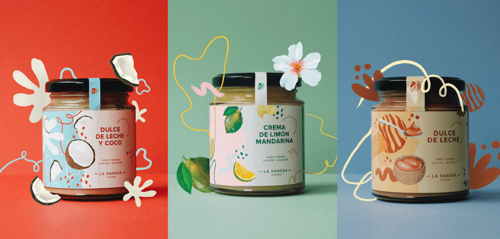
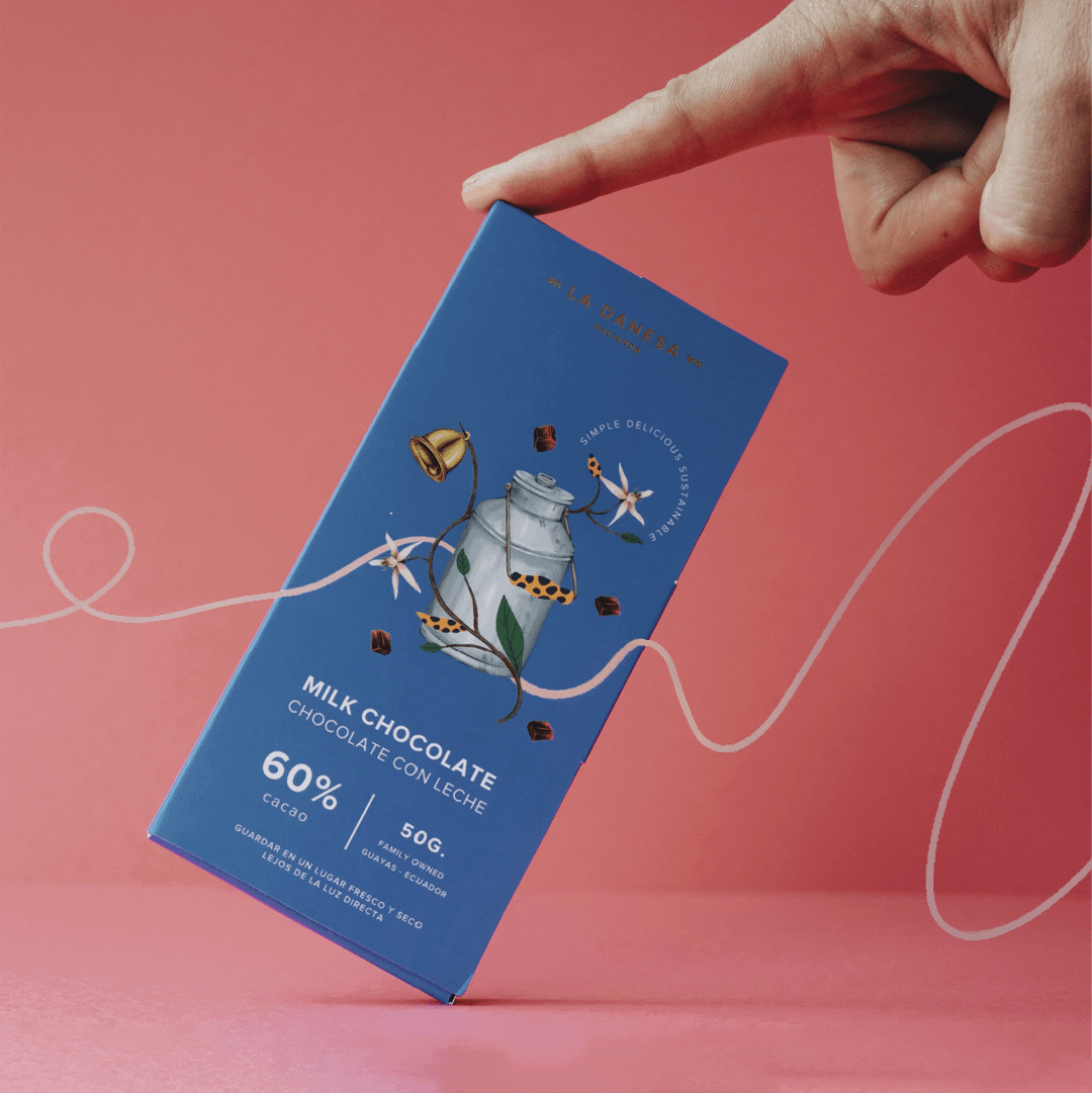
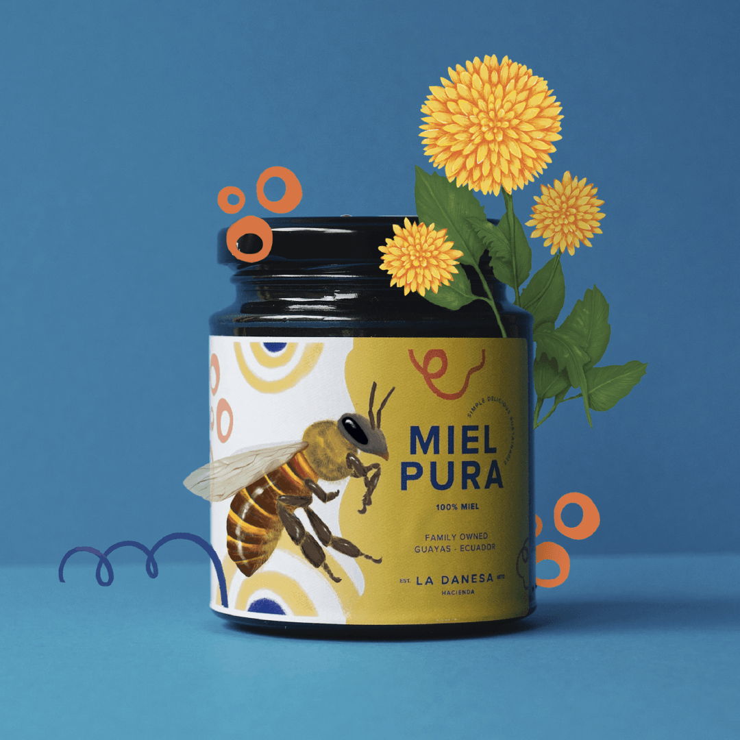
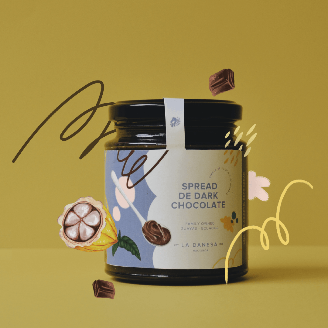
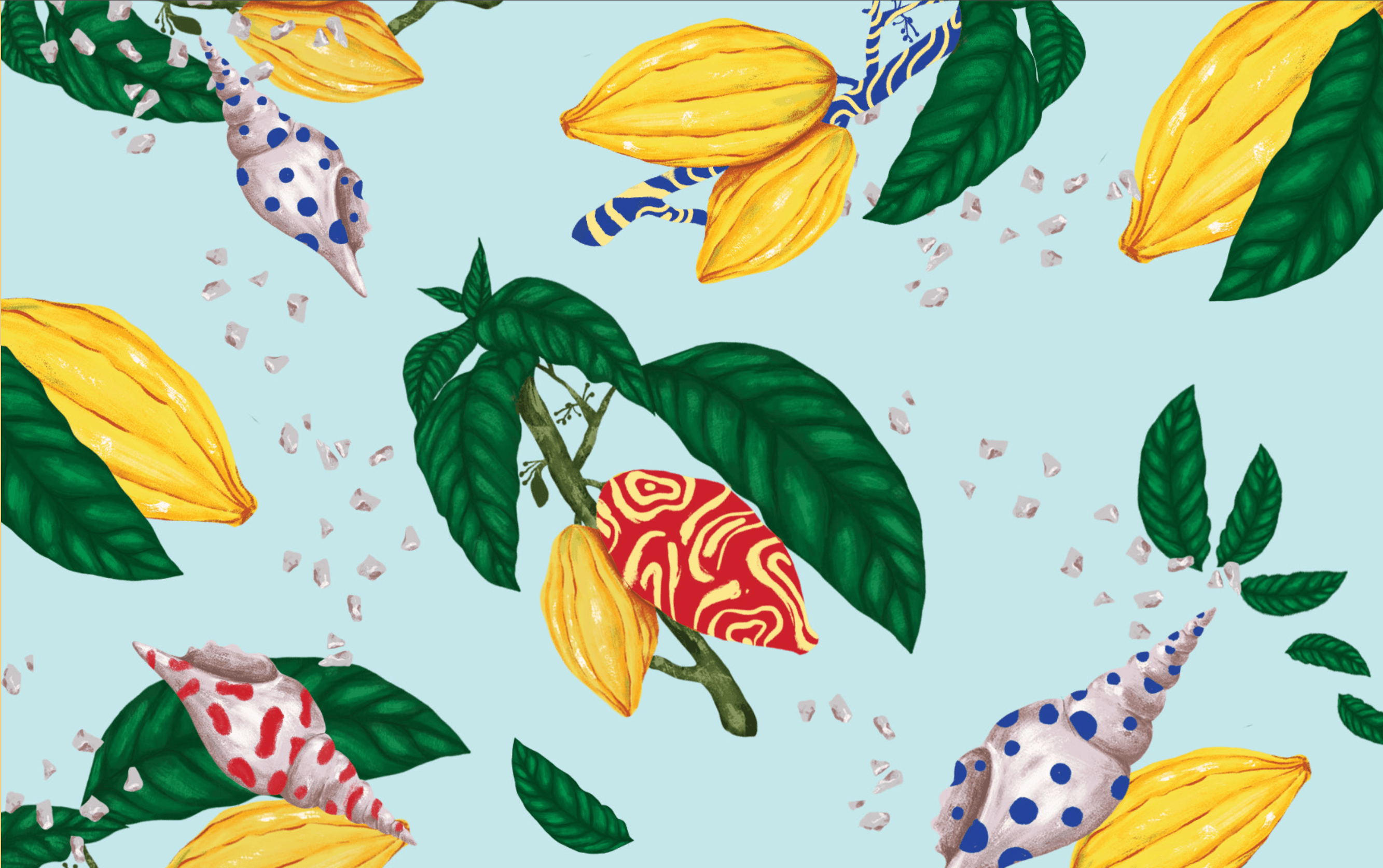
The contrast of styles was the foundation for this branding. Through composition, illustration style, intense colors combined with earth tones, and expressive patterns, we created a unique visual language that feels truly authentic to La Danesa.
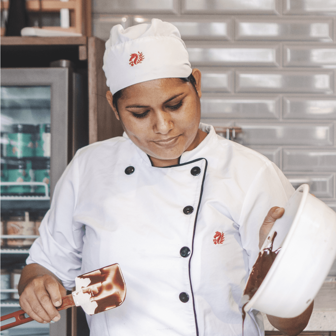
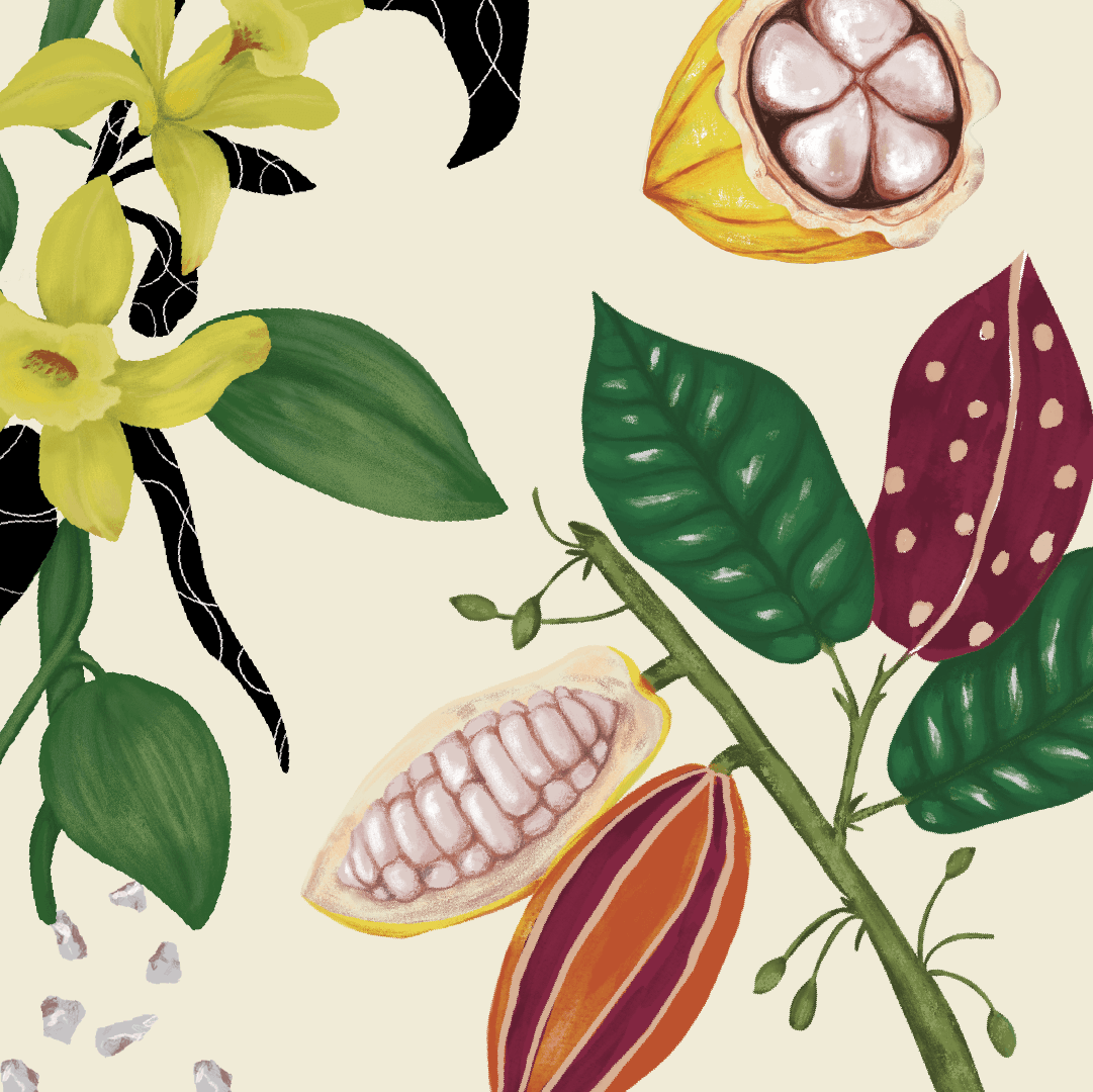
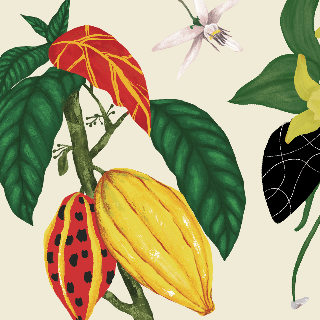
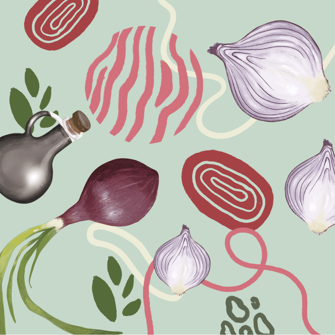
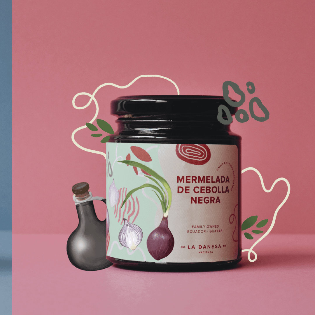
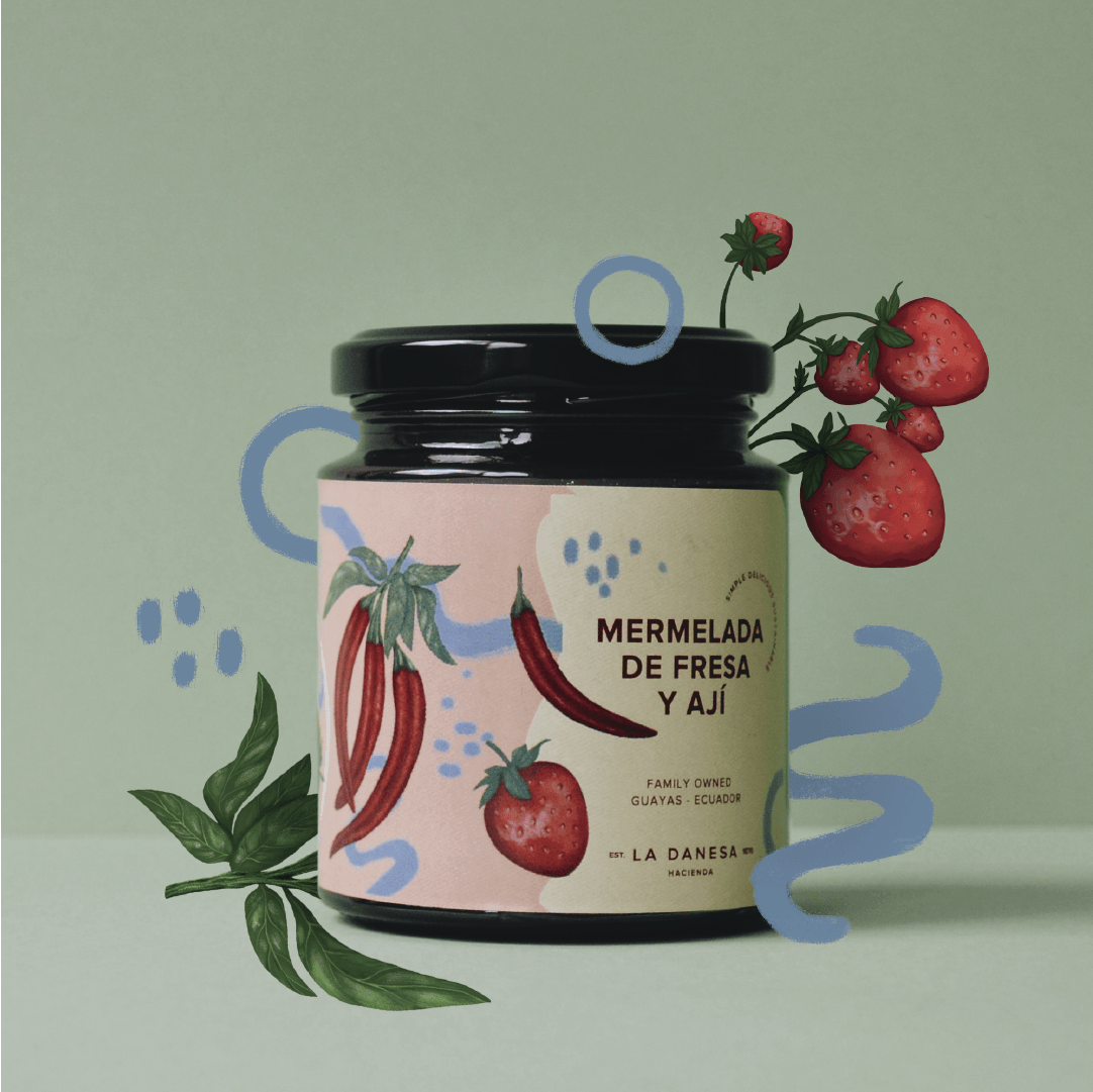
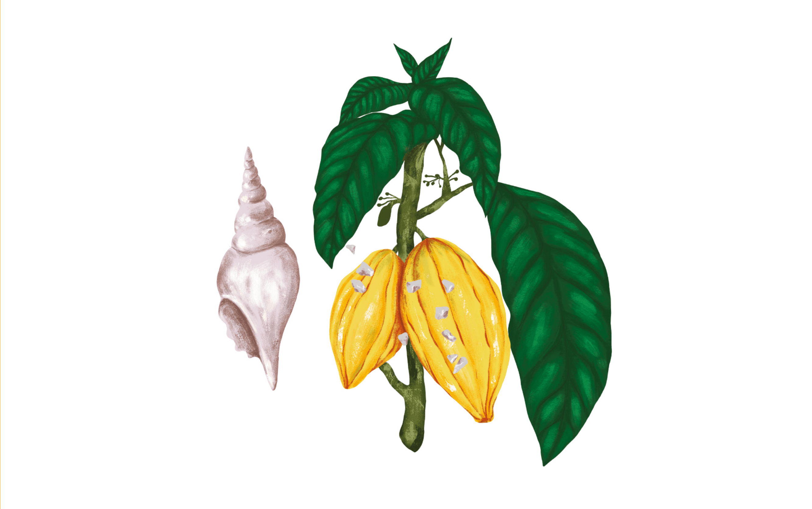
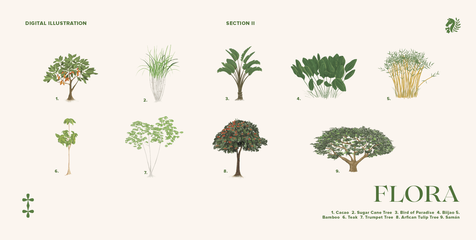
The botanical illustrations were hand-drawn, based on the products handcrafted at the estate: chocolate, honey, jam, and dulce de leche. To make them more contemporary, we accented them with organic, colorful patterns.
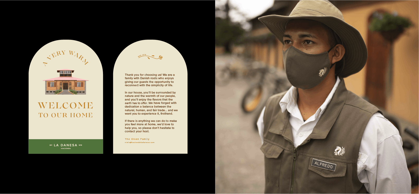
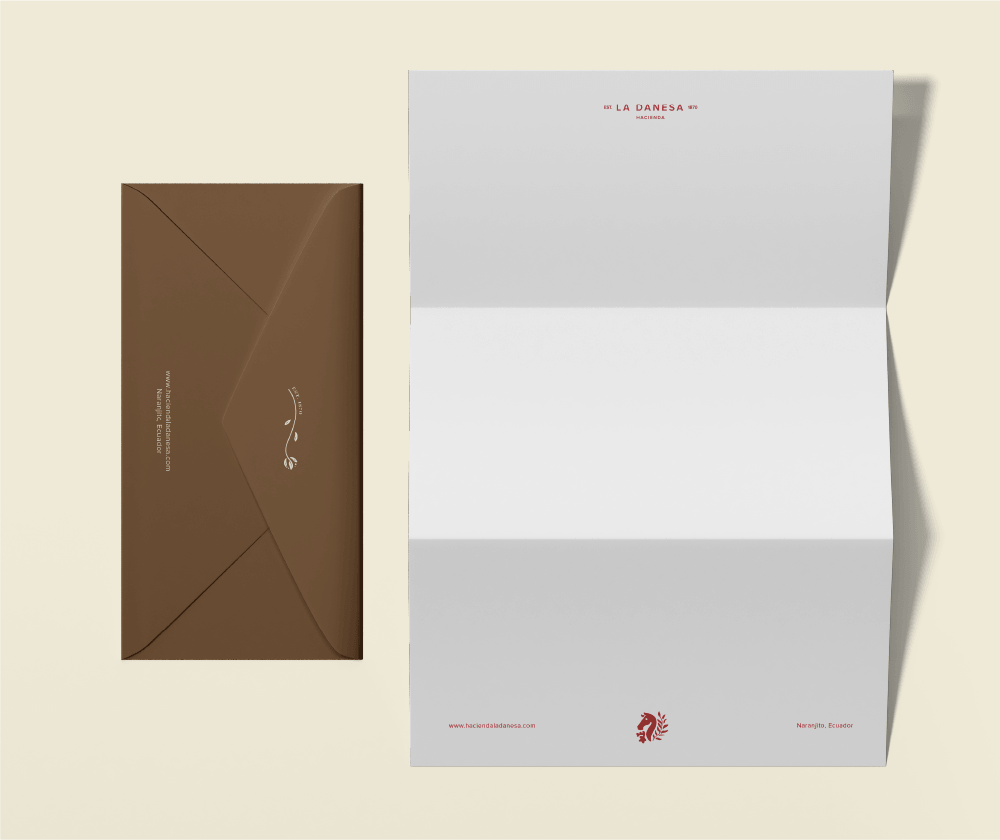
The horse in the logo and the simple typography serve as a reminder that this is a working farm. It grounds the brand's vision of luxury, allowing it to inhabit two worlds: elegance and simplicity. That is La Danesa.
This project was featured on Dieline.
La Danesa was founded in 1870, but it wasn't until nearly 150 years later that it opened its doors to guests from around the world. It is an estate with a rich history and a significant legacy, and despite being a luxury destination, it remains a fully operational working farm immersed in the countryside of the Ecuadorian coast.
We sought a visual identity that would maintain the iconic feel of a hacienda while adding a contemporary twist. We explored several logo options, experimenting with iconic animals from both Ecuadorian and Danish farm life.
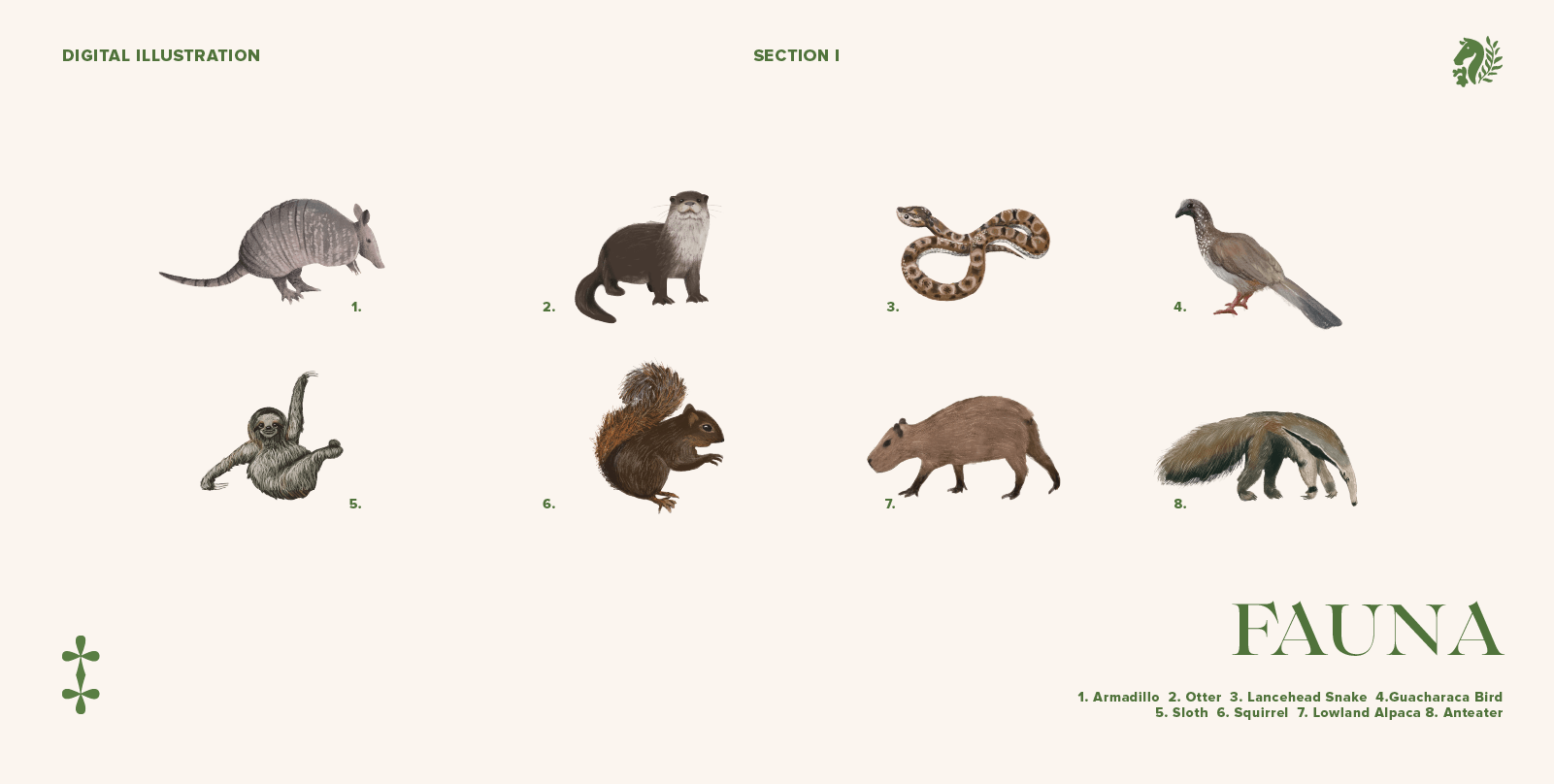
For the illustrations, we proposed using traditional botanical art accented with colorful, organic patterns. We tested and refined the sketches until we landed on a balanced combination of classic and pop.
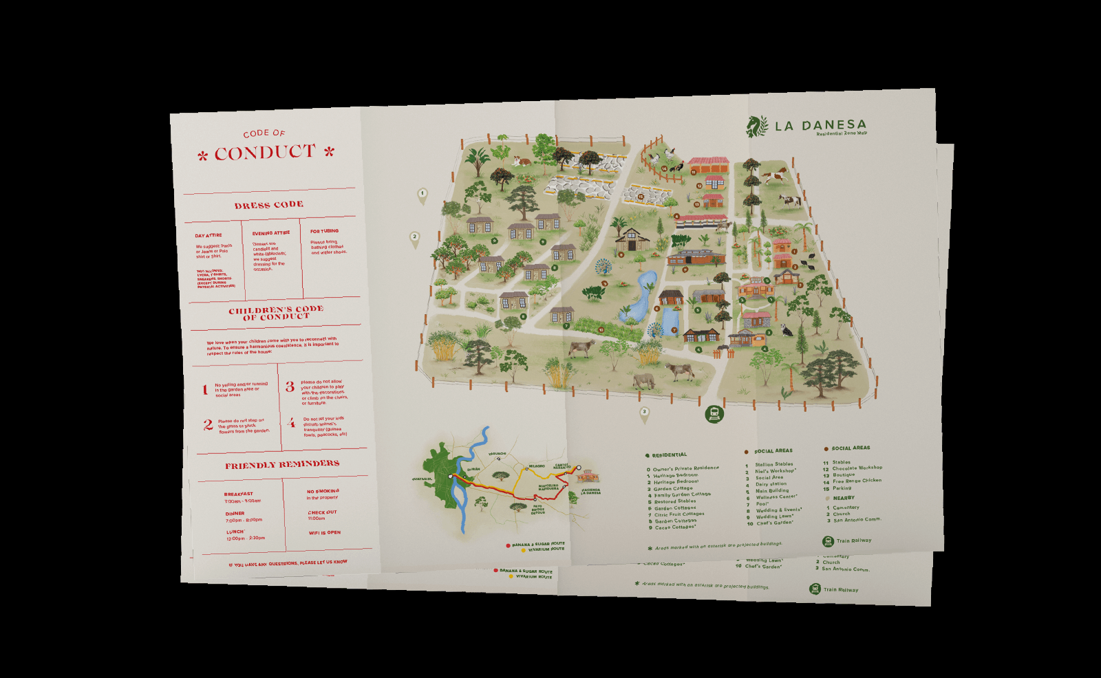
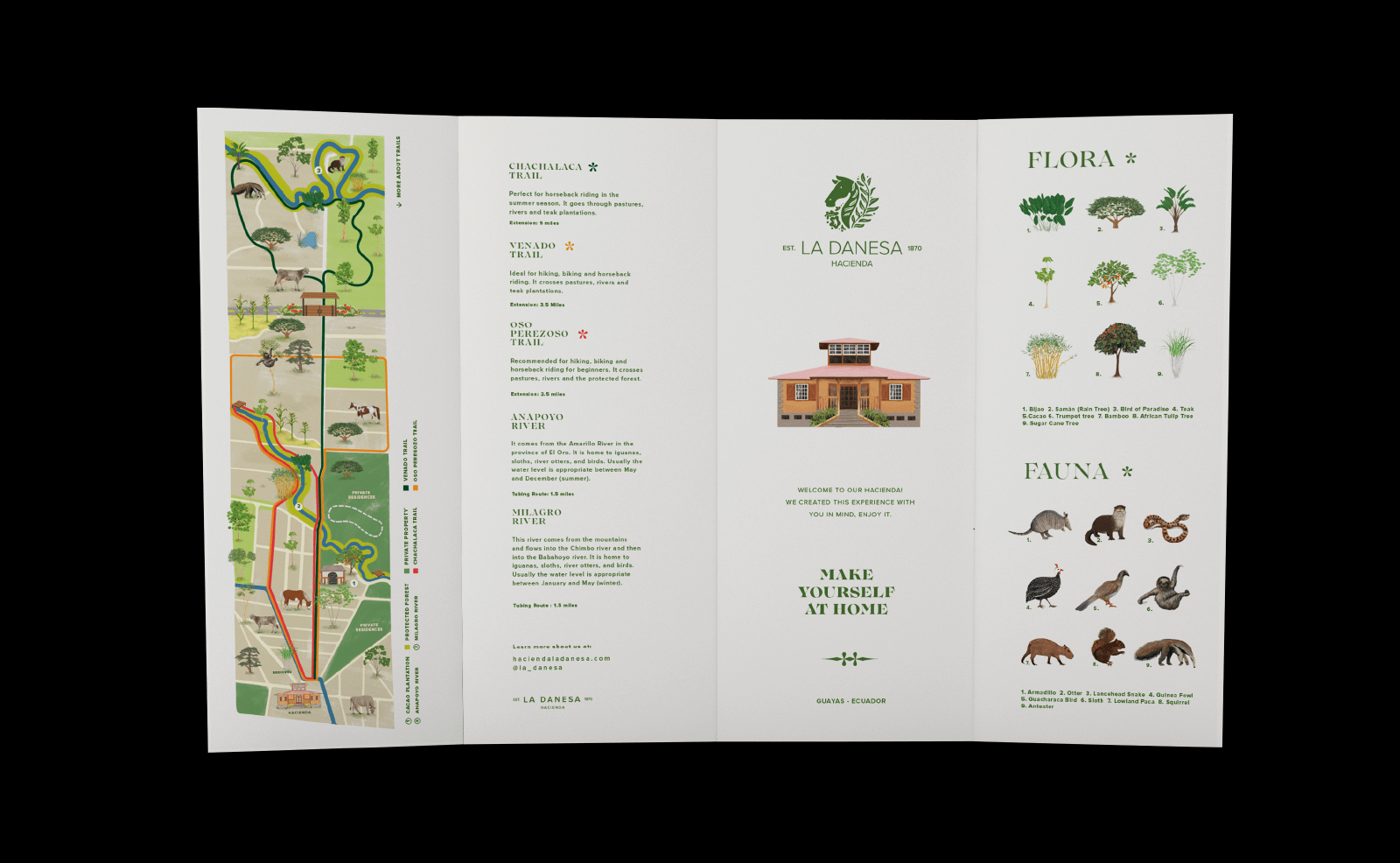
We visited the estate and created an illustrated map so visitors can find their way around and take it home as a souvenir at the end of their stay.