A music festival where the Ecuadorian industry comes together to collaborate.
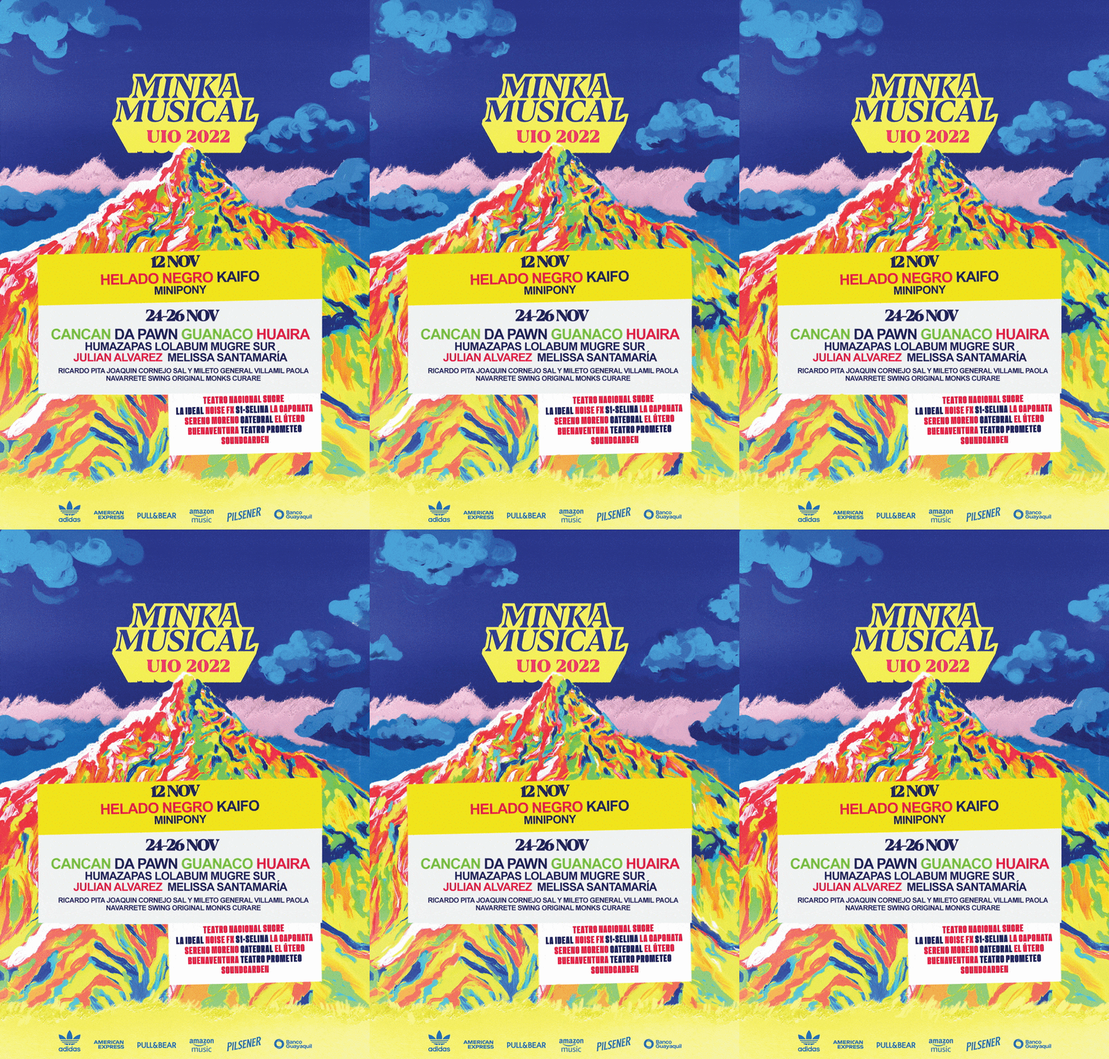
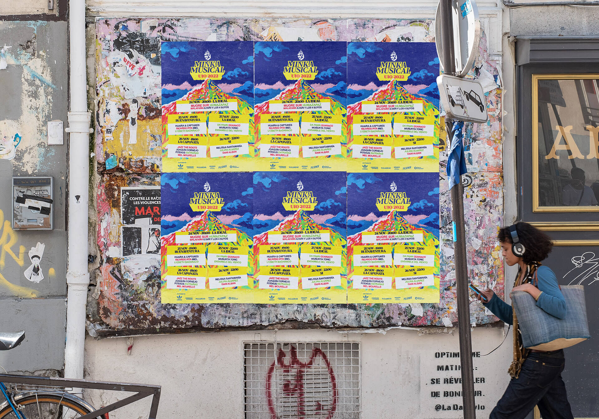
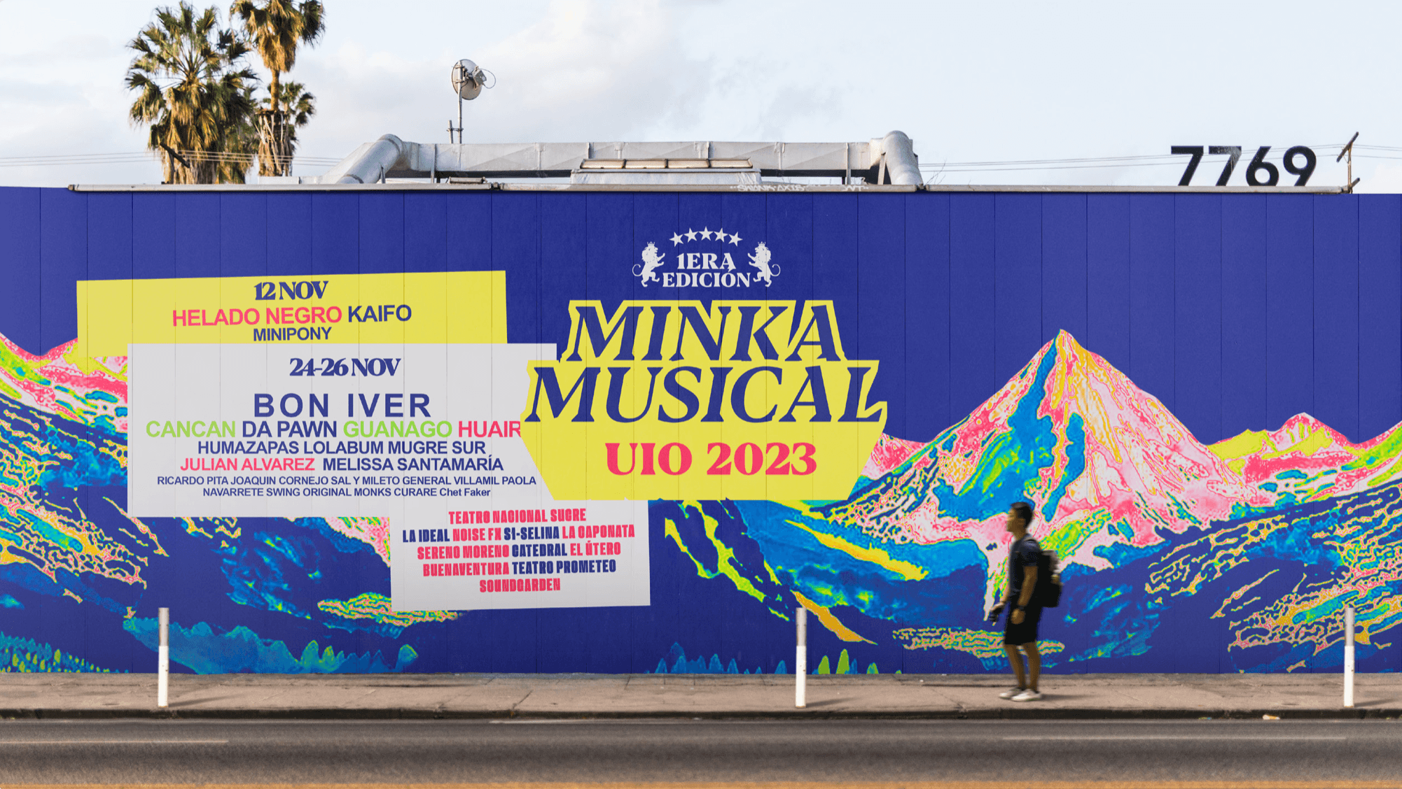
For the festival's main poster, we took the quintessential Quito symbol—the mountain—and painted it with an organic, melted heat map to mimic the psychedelic feel of popular street art.
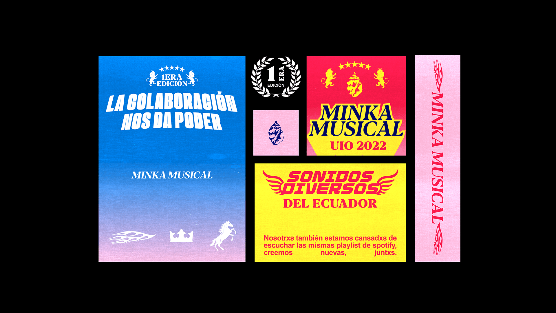
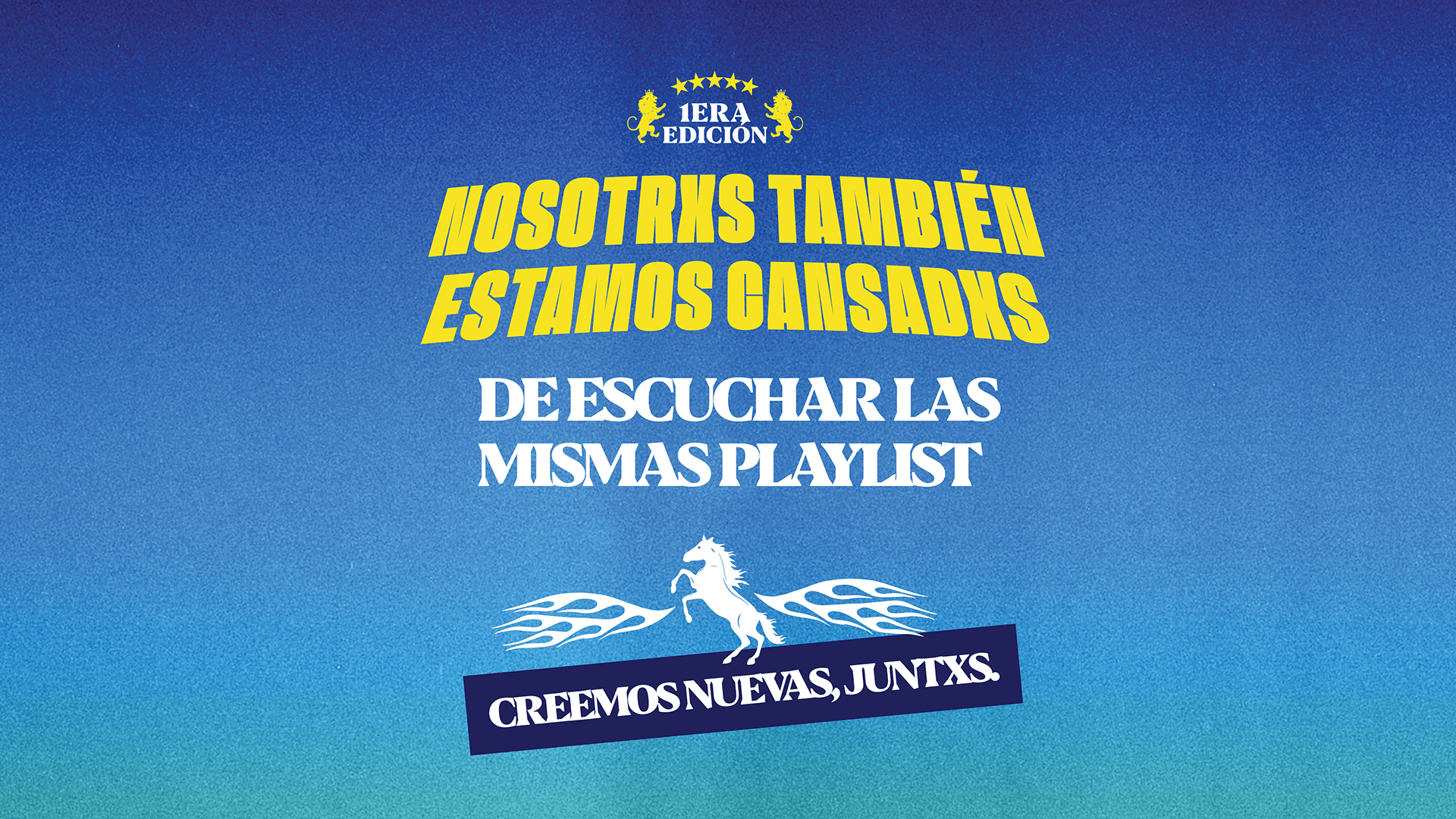
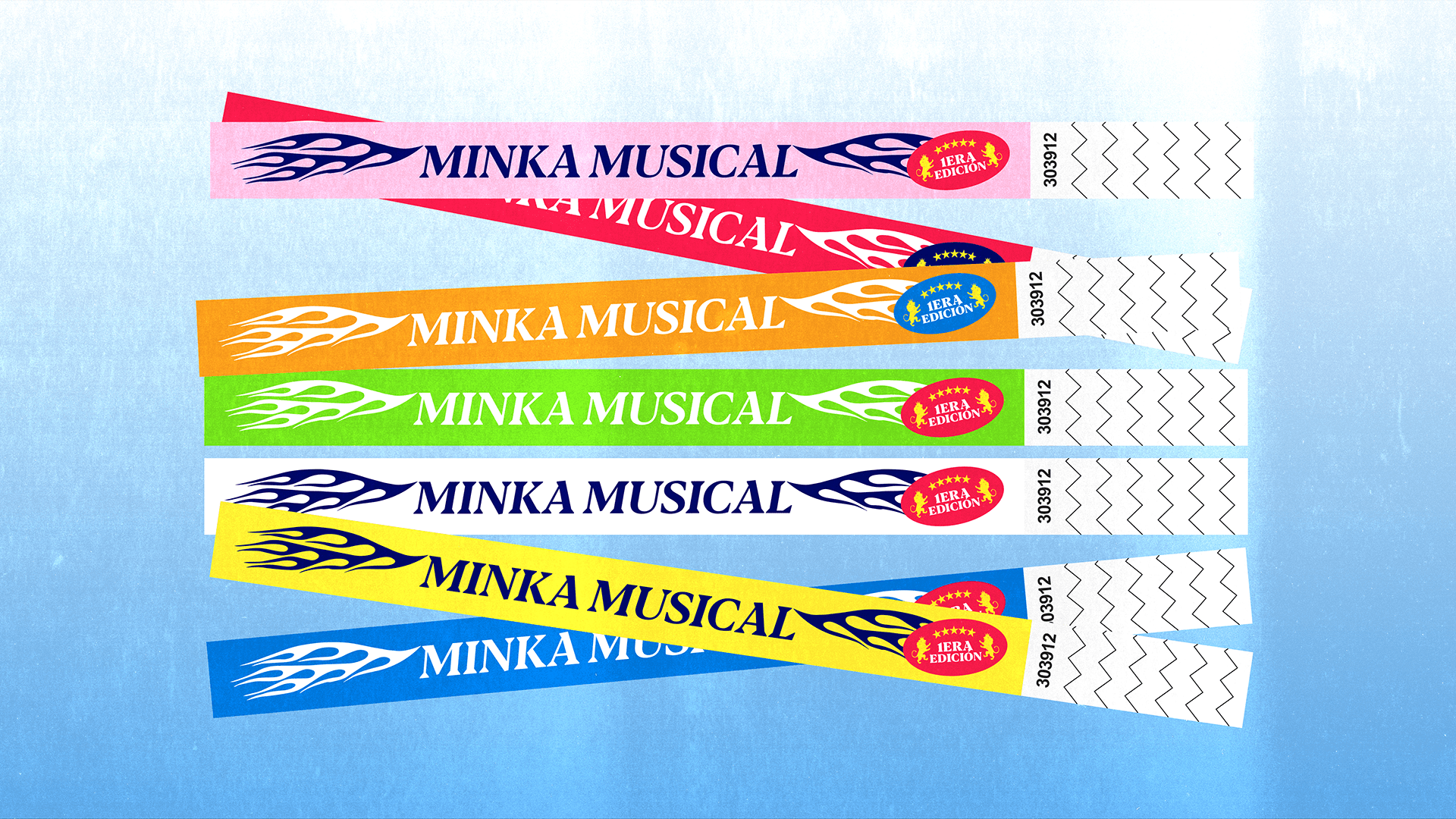
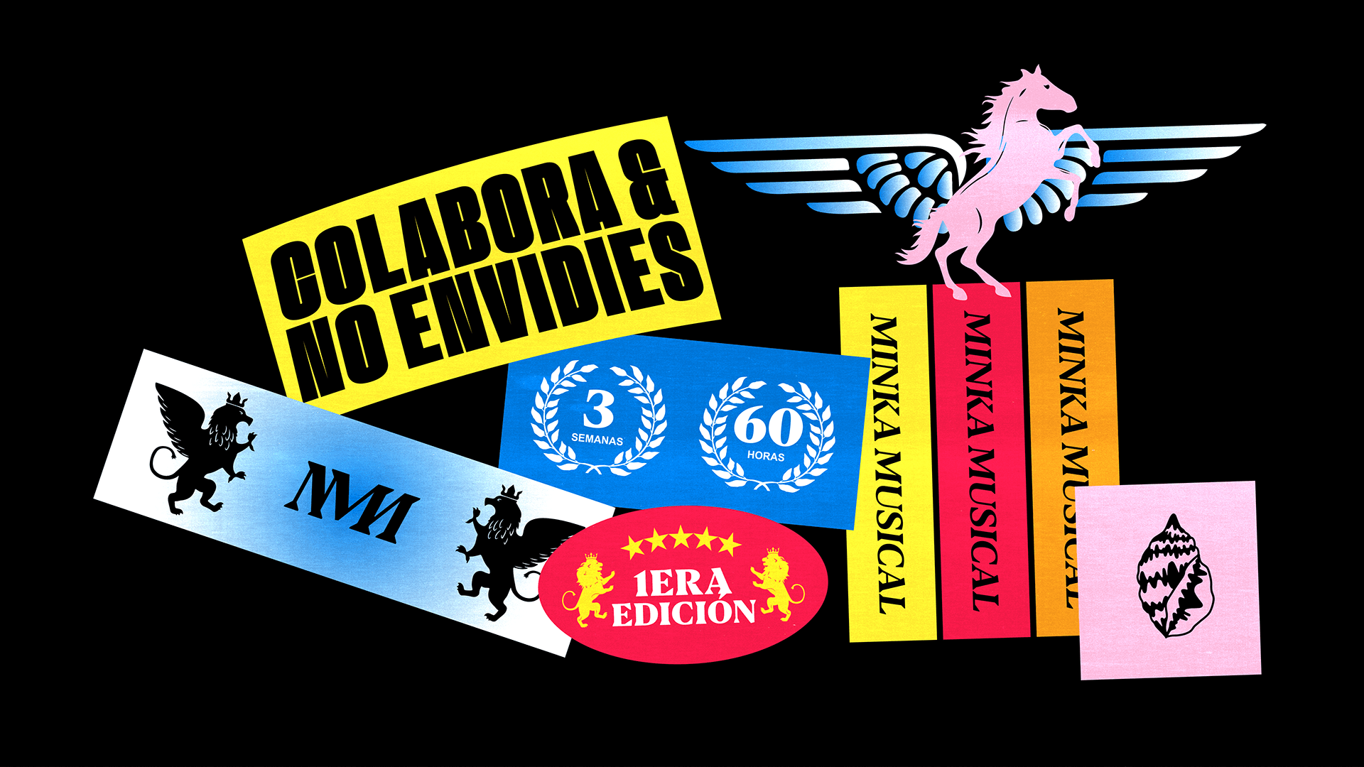
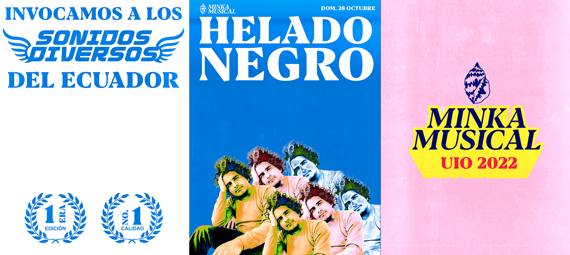
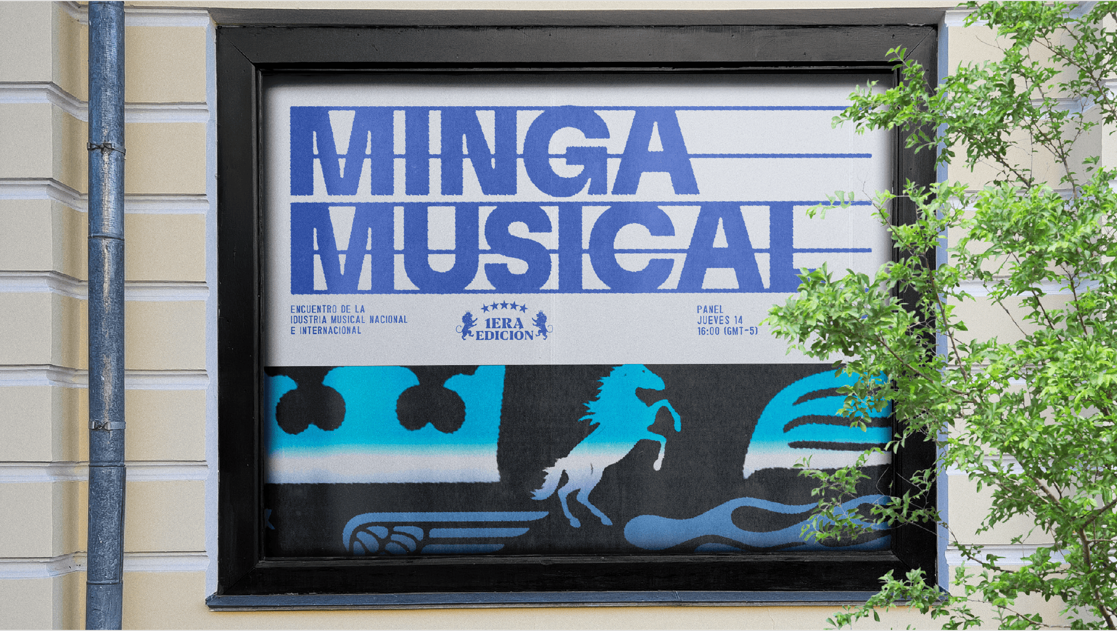
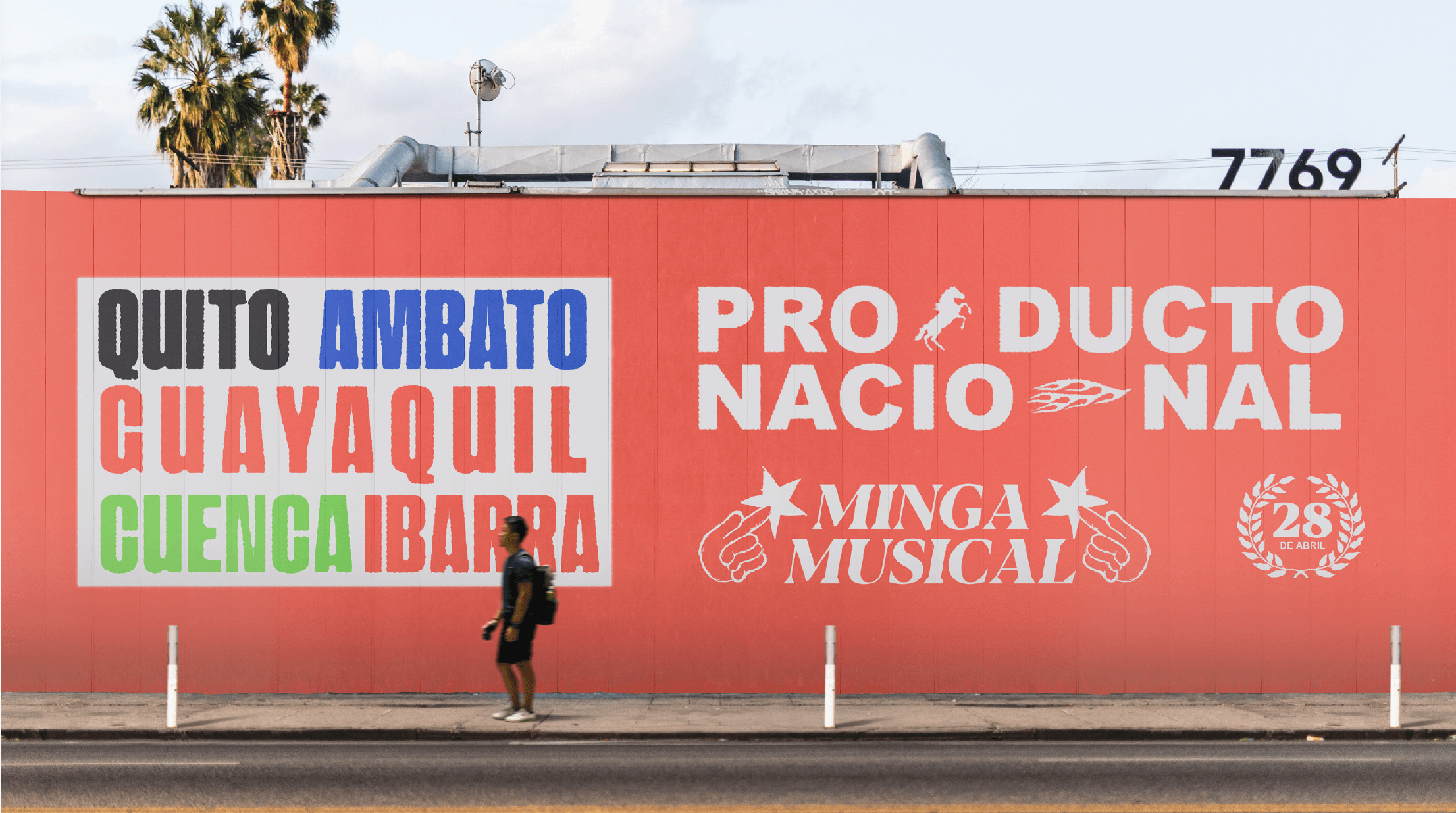
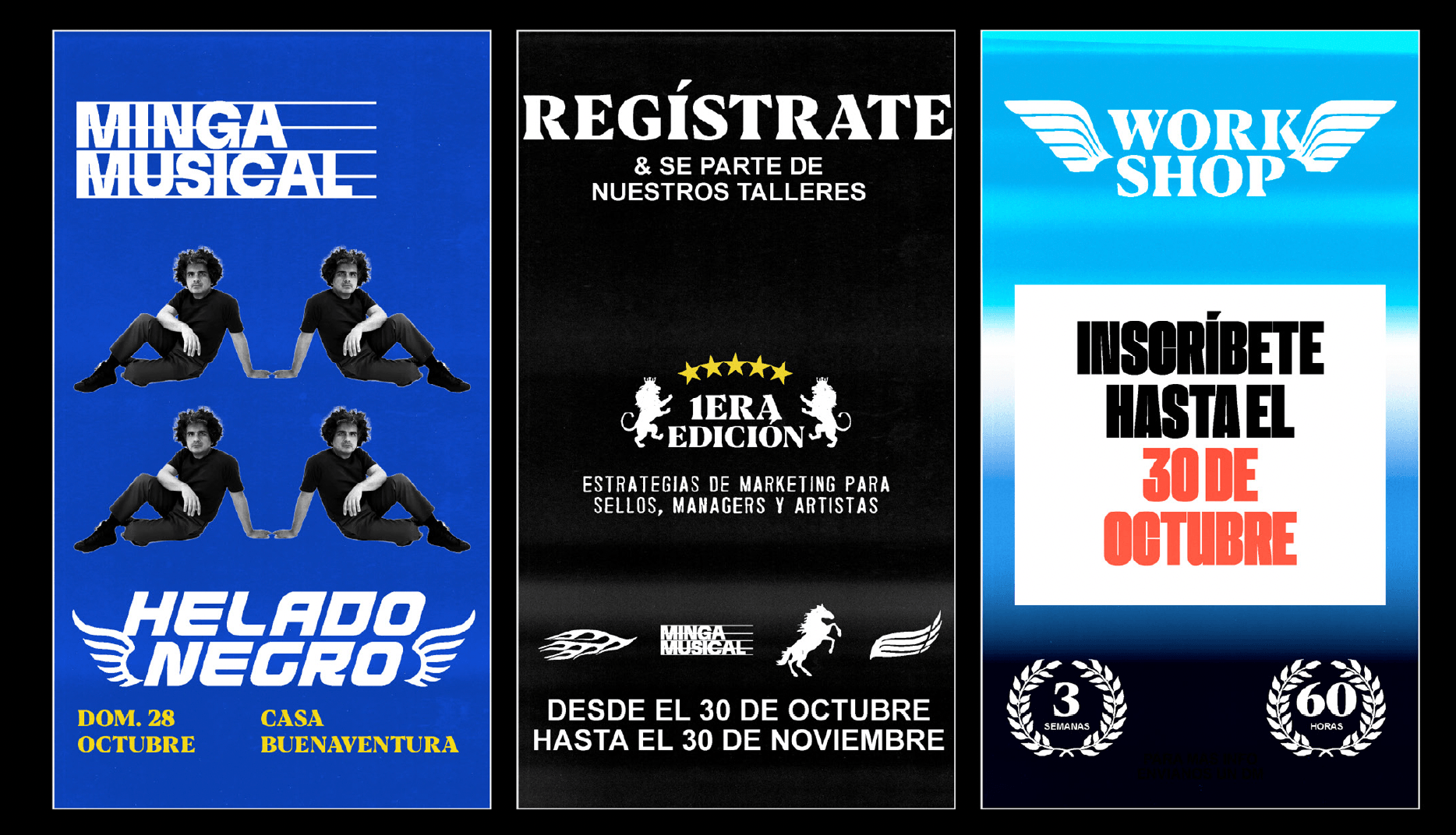
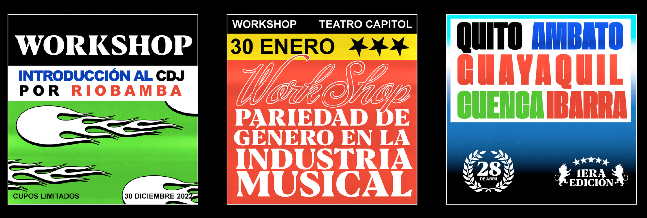
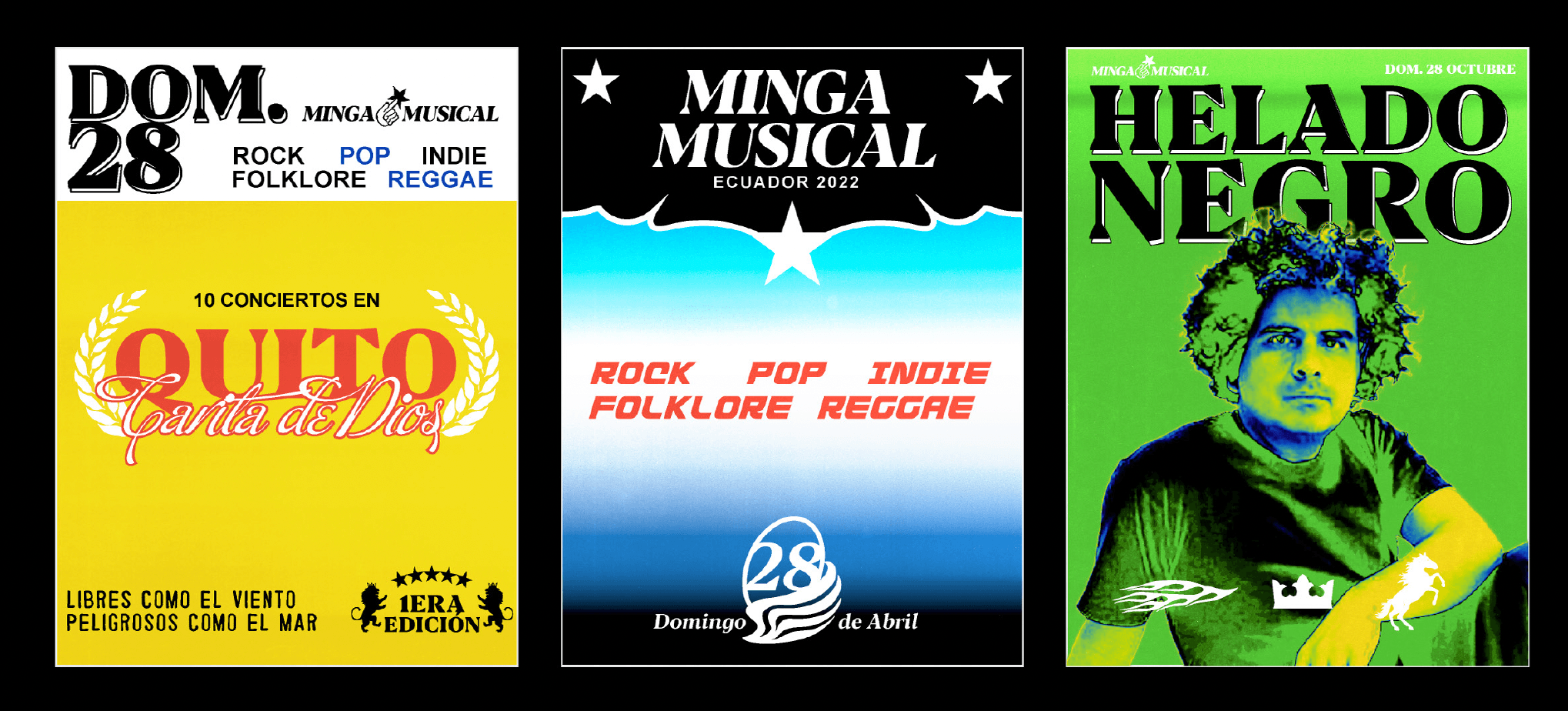
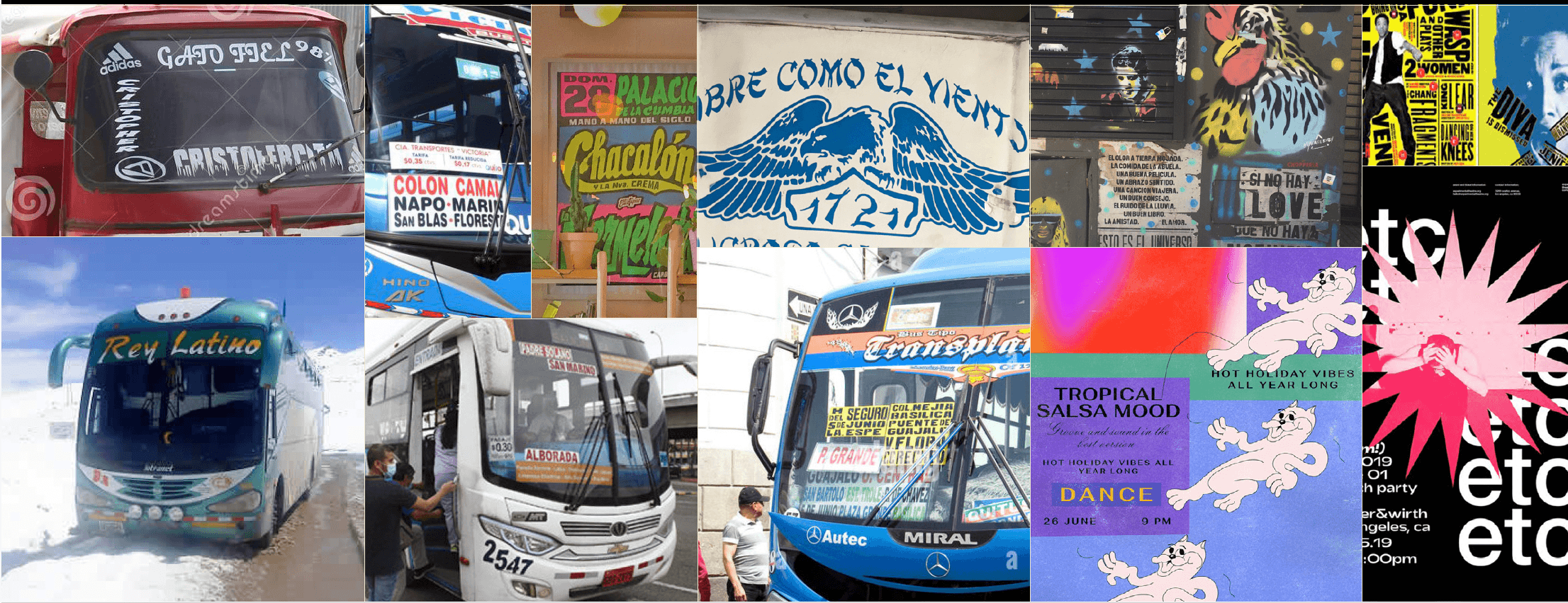
For the supporting posters, social media assets, and merchandise, we created typographic compositions and decorative icons based on the stickers you’d find on the window of a Colón-Camal or Reina del Camino bus.
We wanted to create something that felt colorful and casual, capable of speaking to a diverse range of audiences and connecting with all kinds of Ecuadorians, because that is the essence of the minka (or minga): everyone coming together to collaborate.
The creators of Minka Musical gave us a lot of creative freedom for this project. Since it’s a celebration of Ecuadorian music, we wanted to do something that felt very authentic—like an inside joke, but completely fresh.
We drew inspiration from the graphics on urban and interprovincial buses, particularly the stickers and iconic phrases every Ecuadorian knows, to create a visual language never before seen for a festival of this kind.
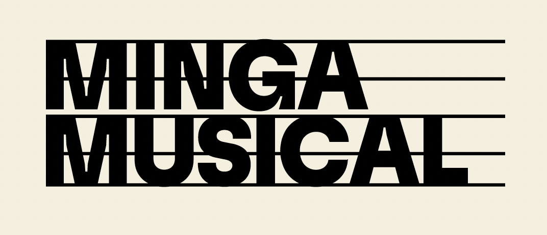
We experimented with the logo, gradients, composition, and illustration until we found the final version. We wanted to be able to modulate the "intensity" of the graphics to create a more serious or more eye-catching tone as needed, keeping in mind that the festival had to speak to many different audiences at once.