A university that shapes fair and humane individuals who transform society.
With this rebranding, we not only helped organize the university's multiple departments, services, and sub-brands under a common logic, but we also managed to align the essence of UHE—a modern and humane university—with how it presents itself to the world.
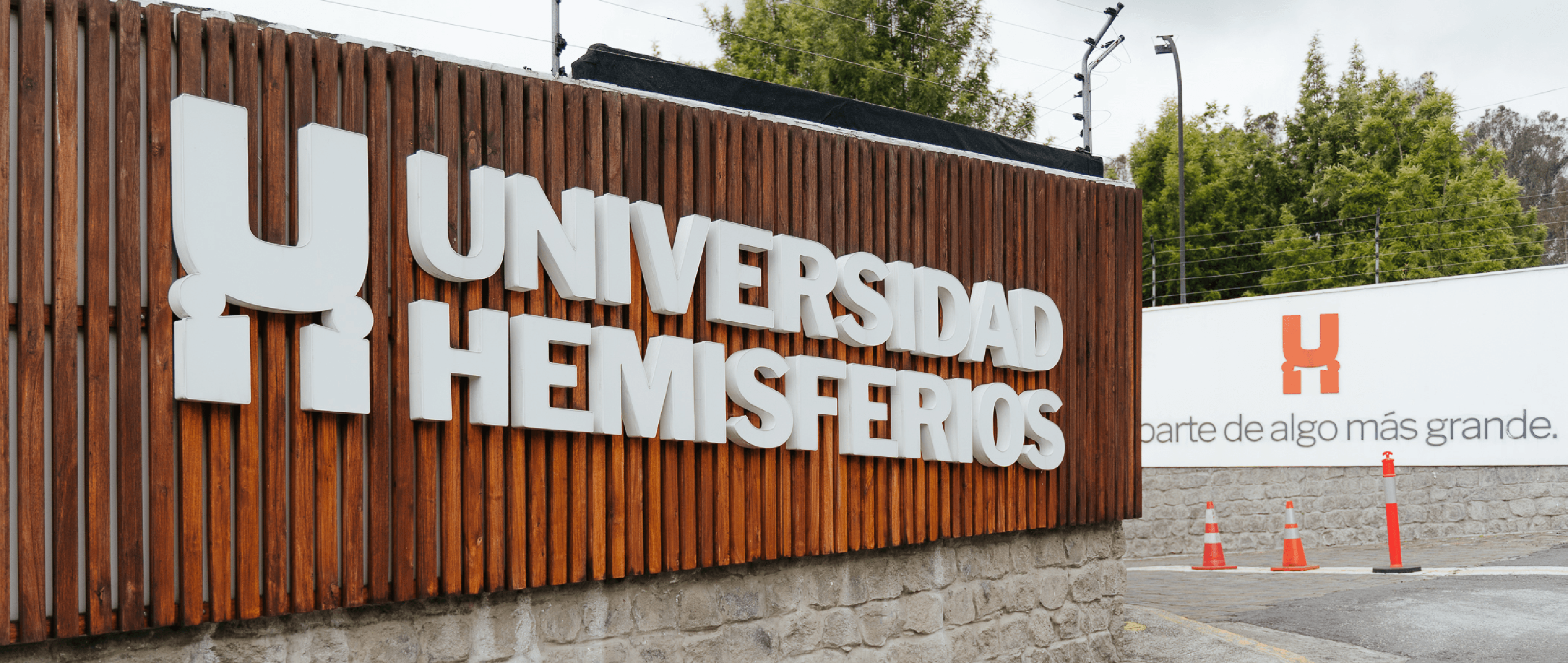
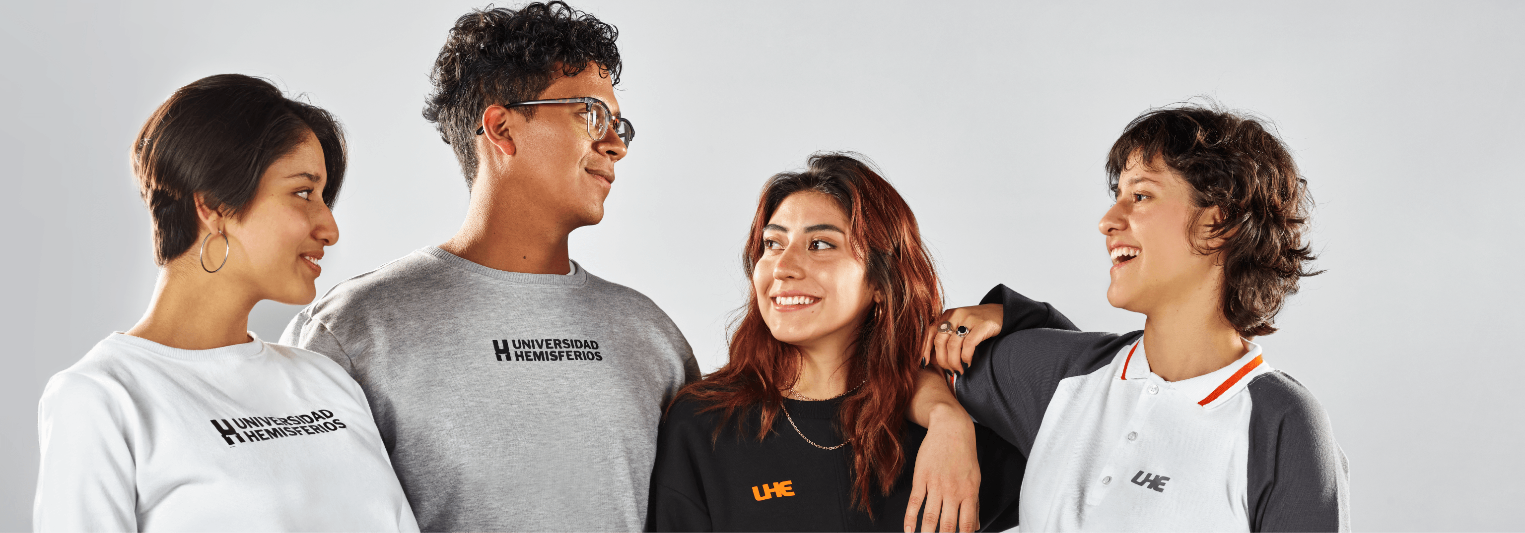
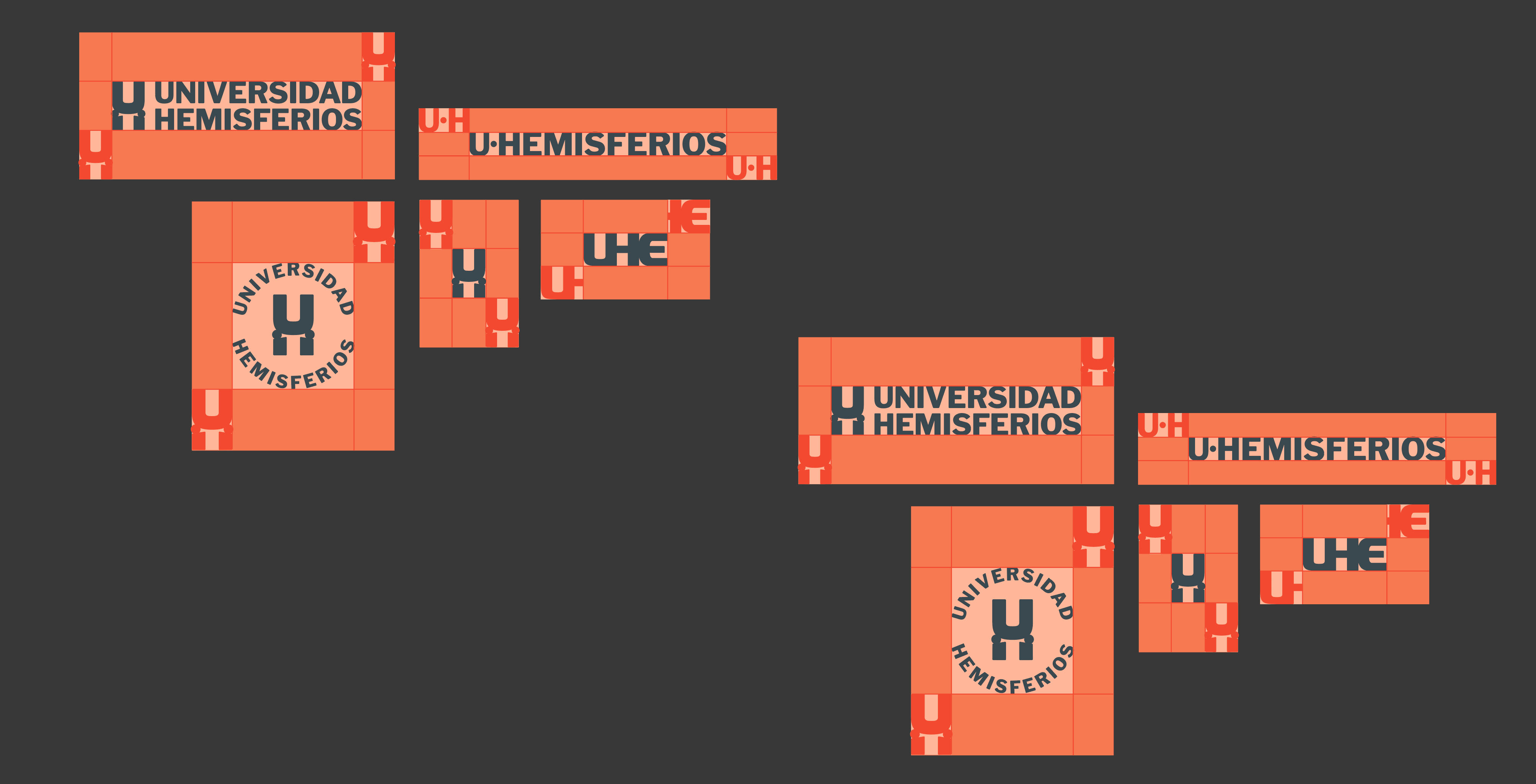
First, we simplified the name (originally “Universidad de los Hemisferios”) to align it with how people organically remembered it: Universidad Hemisferios. We also created a reduced version of the logo so the brand could easily position “UHE.”
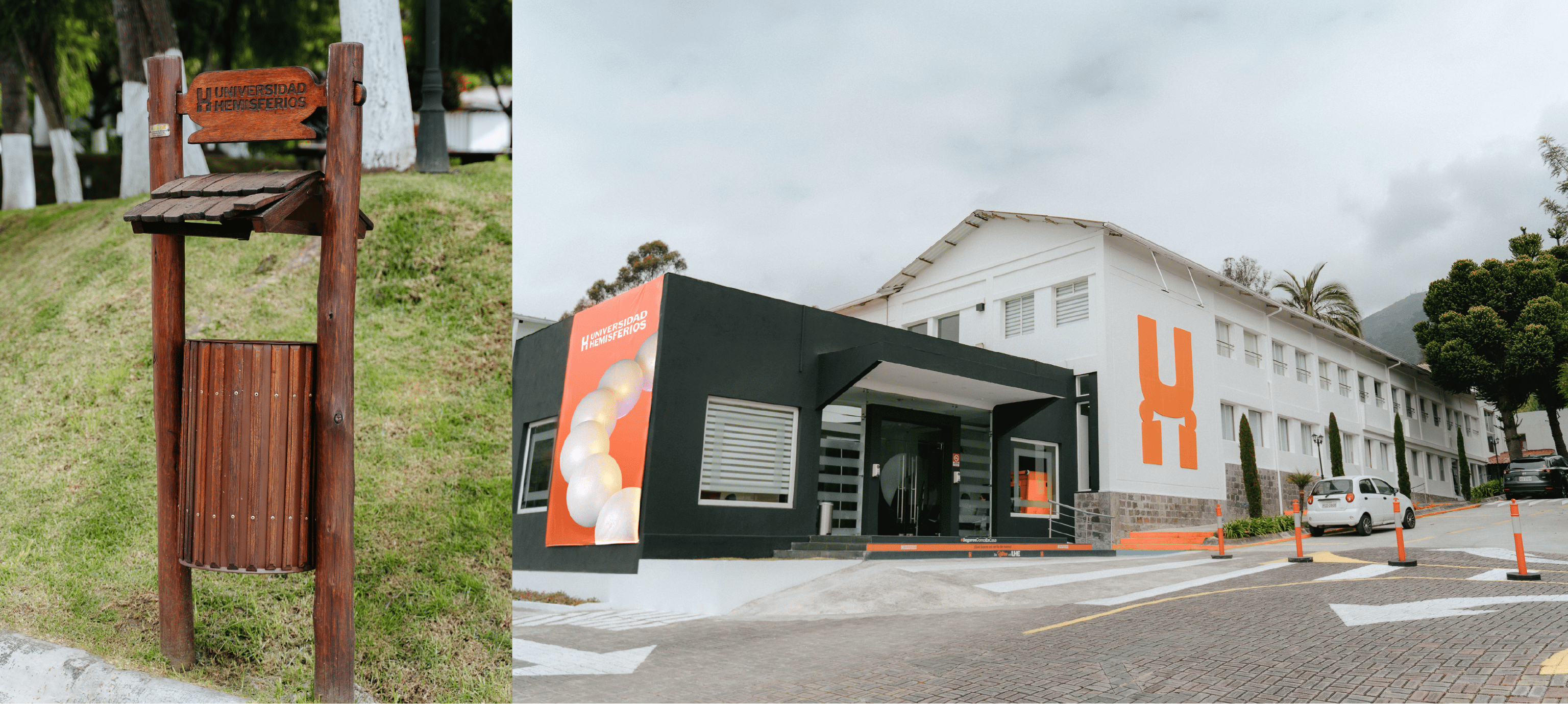
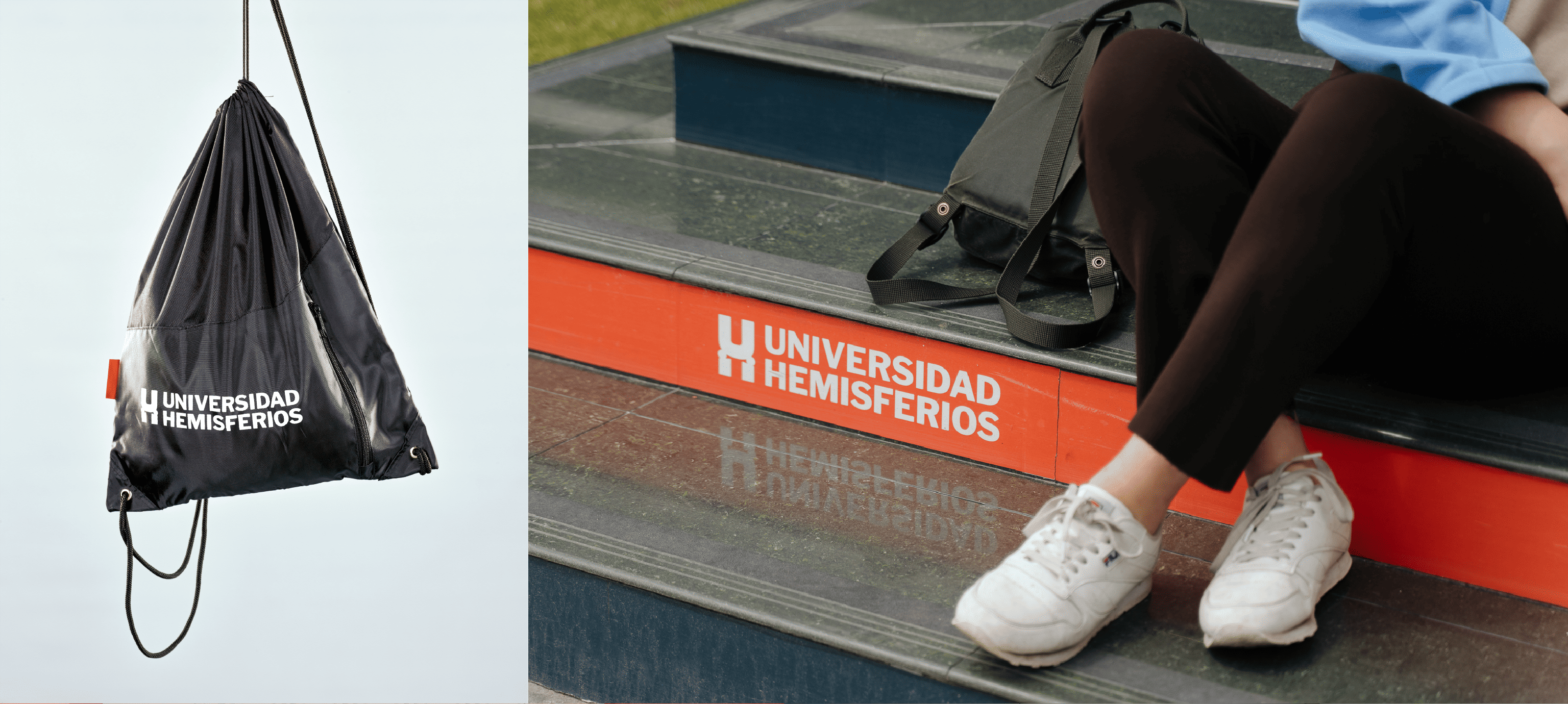
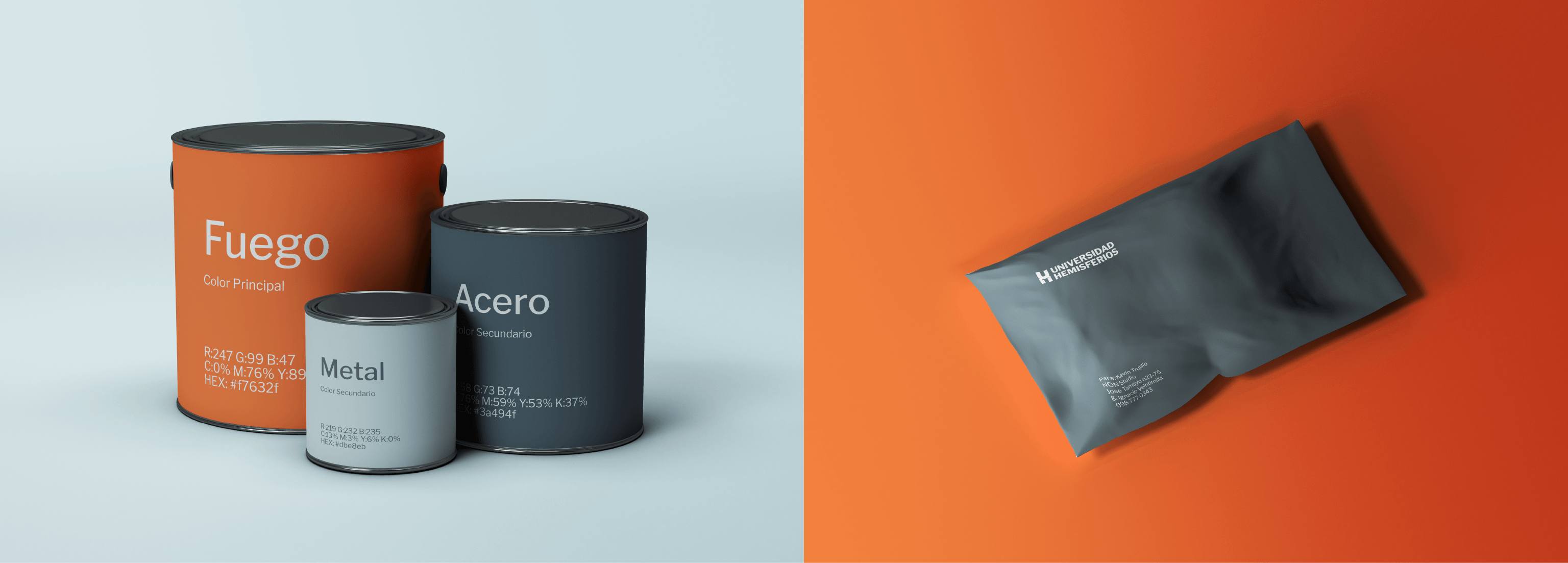
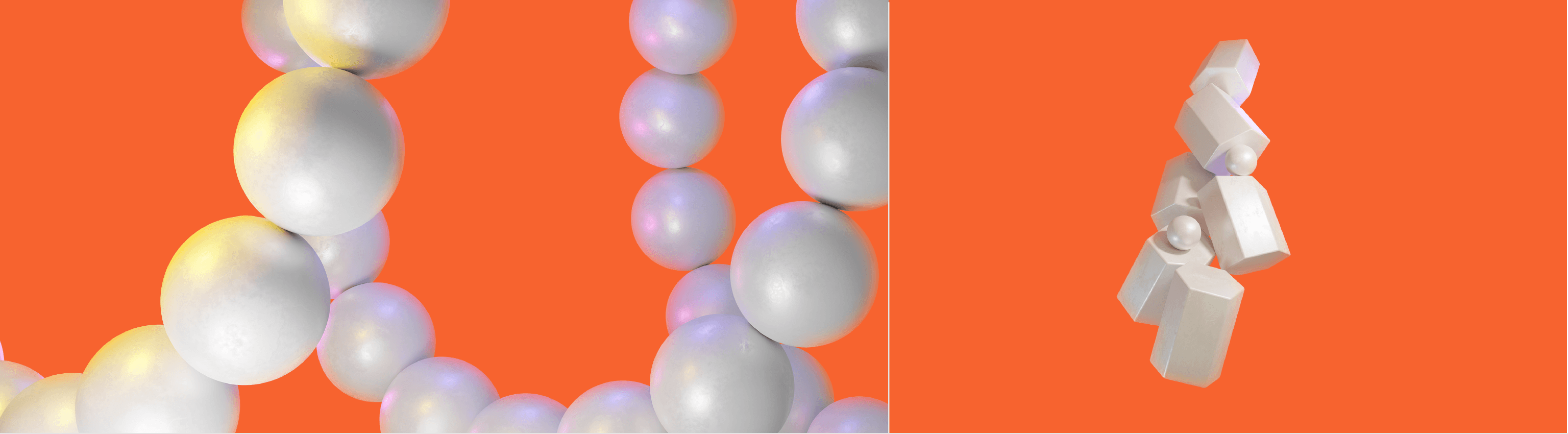
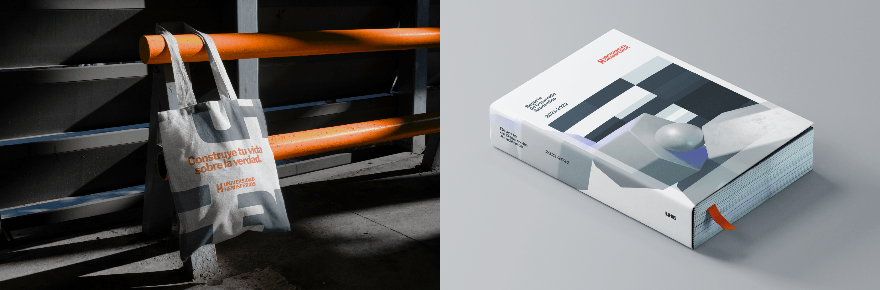
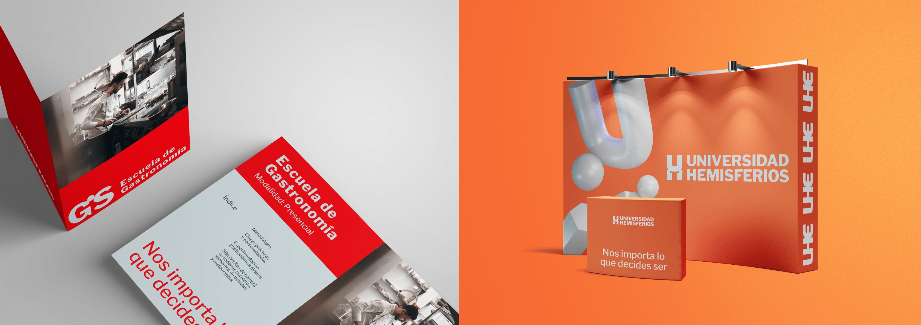
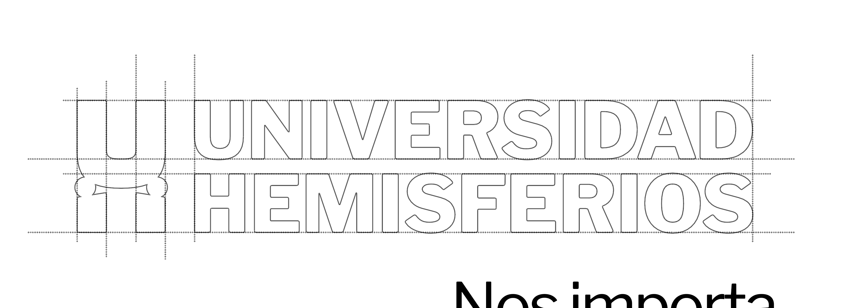
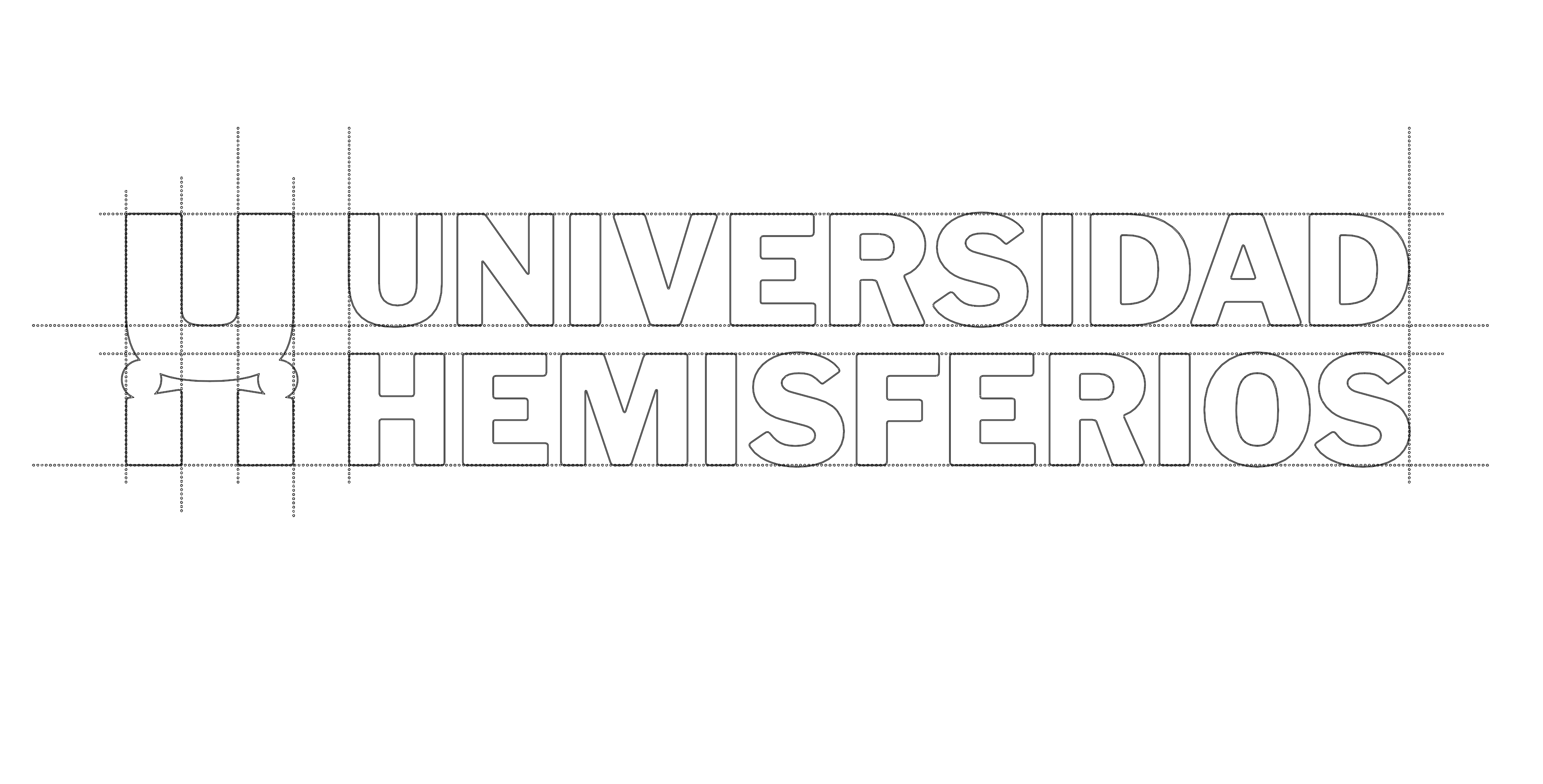
Completely changing the logo and colors was a strategic decision for the brand. The original yellow and blue was a combination being used by at least 3 other major universities in the country. The original construction of the logo complicated its reproduction in small formats and gave the perception of a much more conservative institution. We built the new logo with an icon that has the human being as a pillar; the “H” is formed by two people holding a “U.” With these pillars, we designed 3D graphic resources: a series of circles and columns that transform to create dynamic patterns that unfold in different ways throughout the communication.
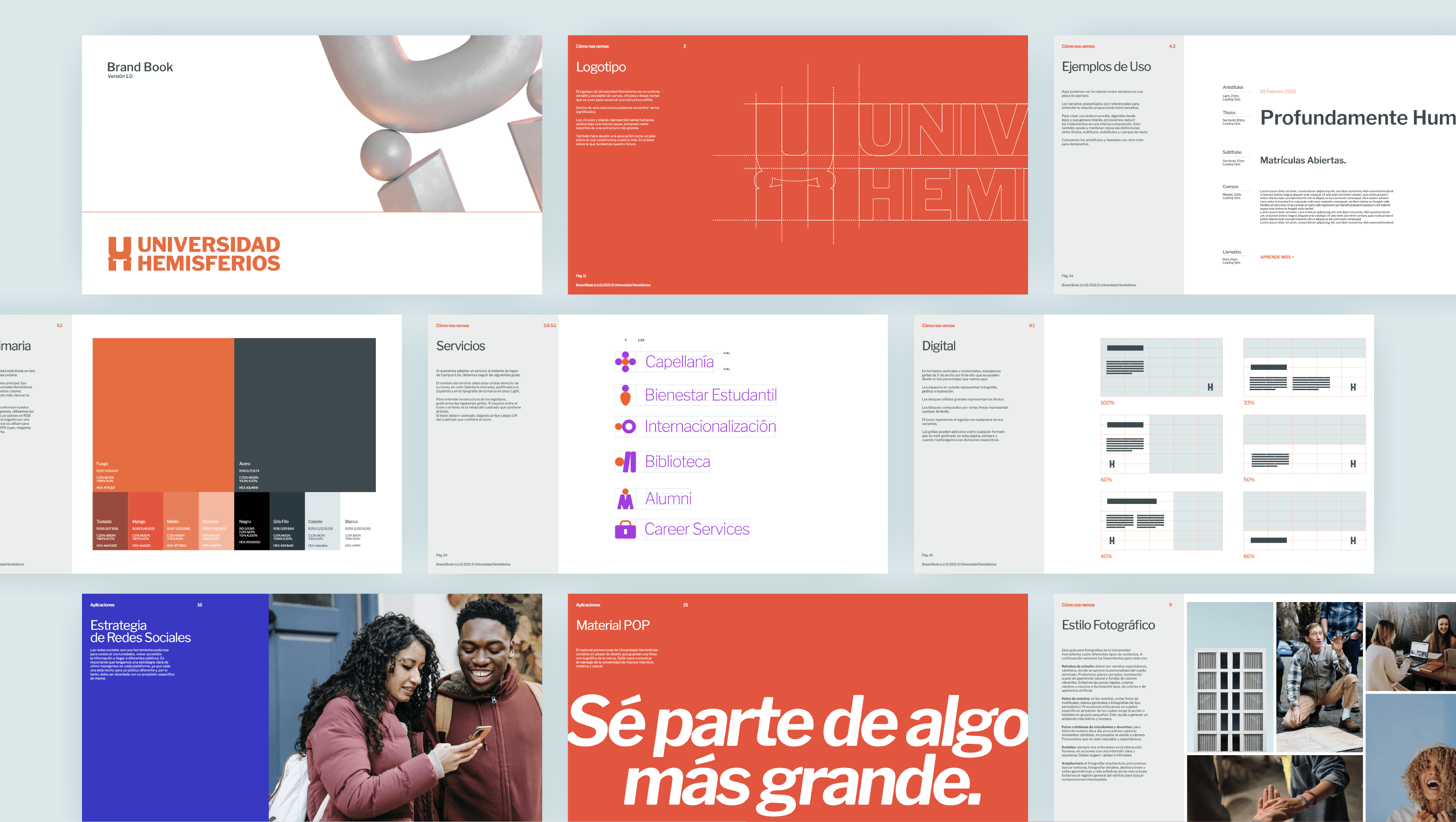
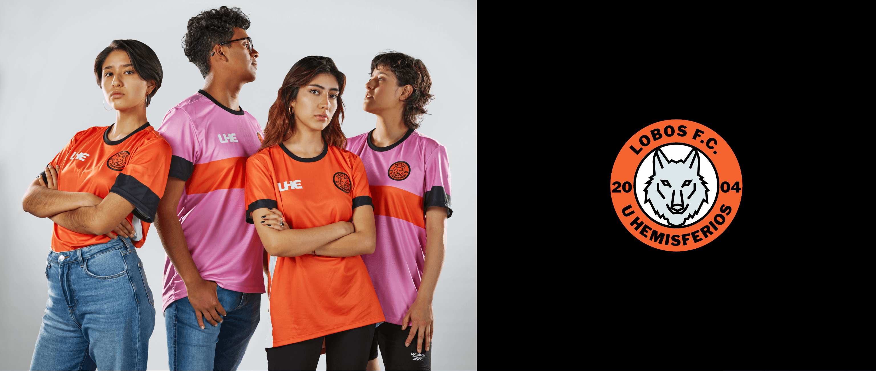
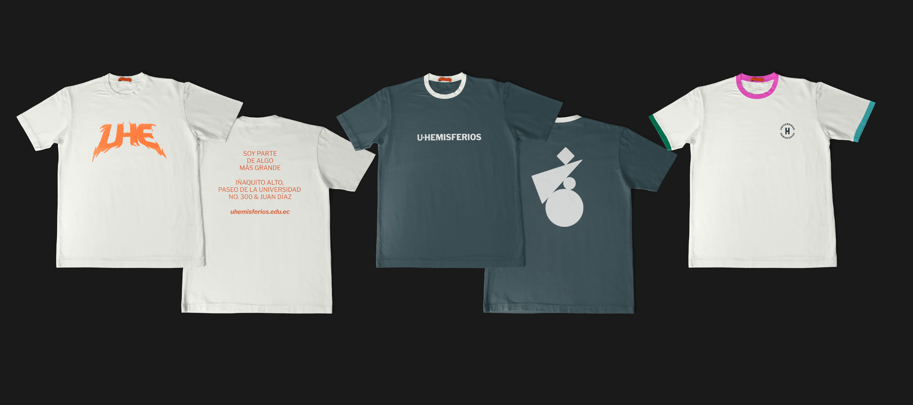
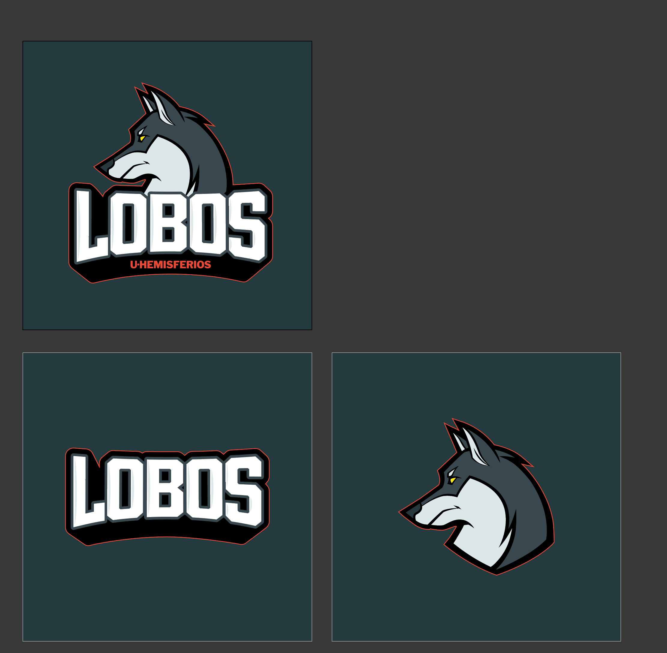
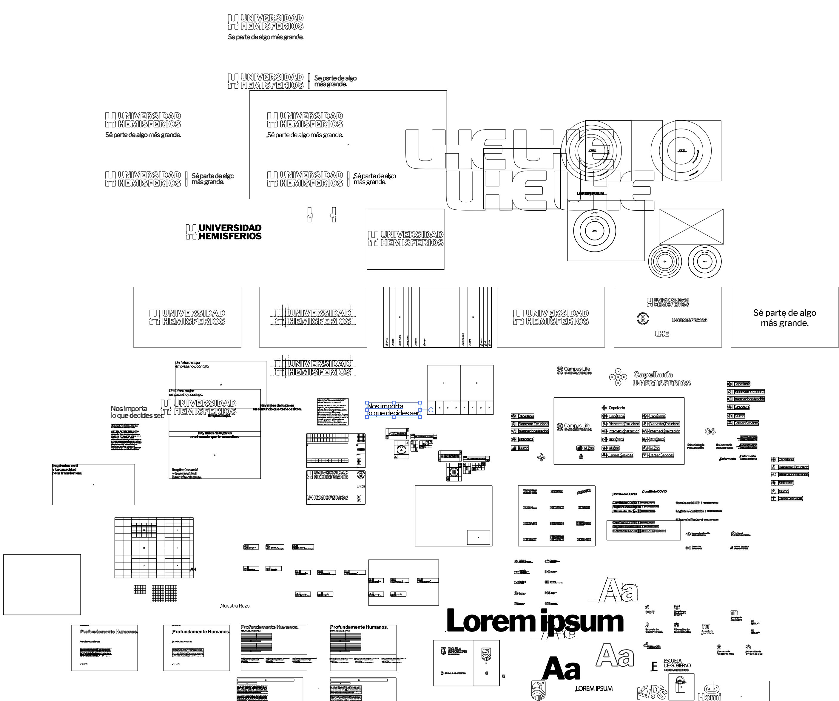
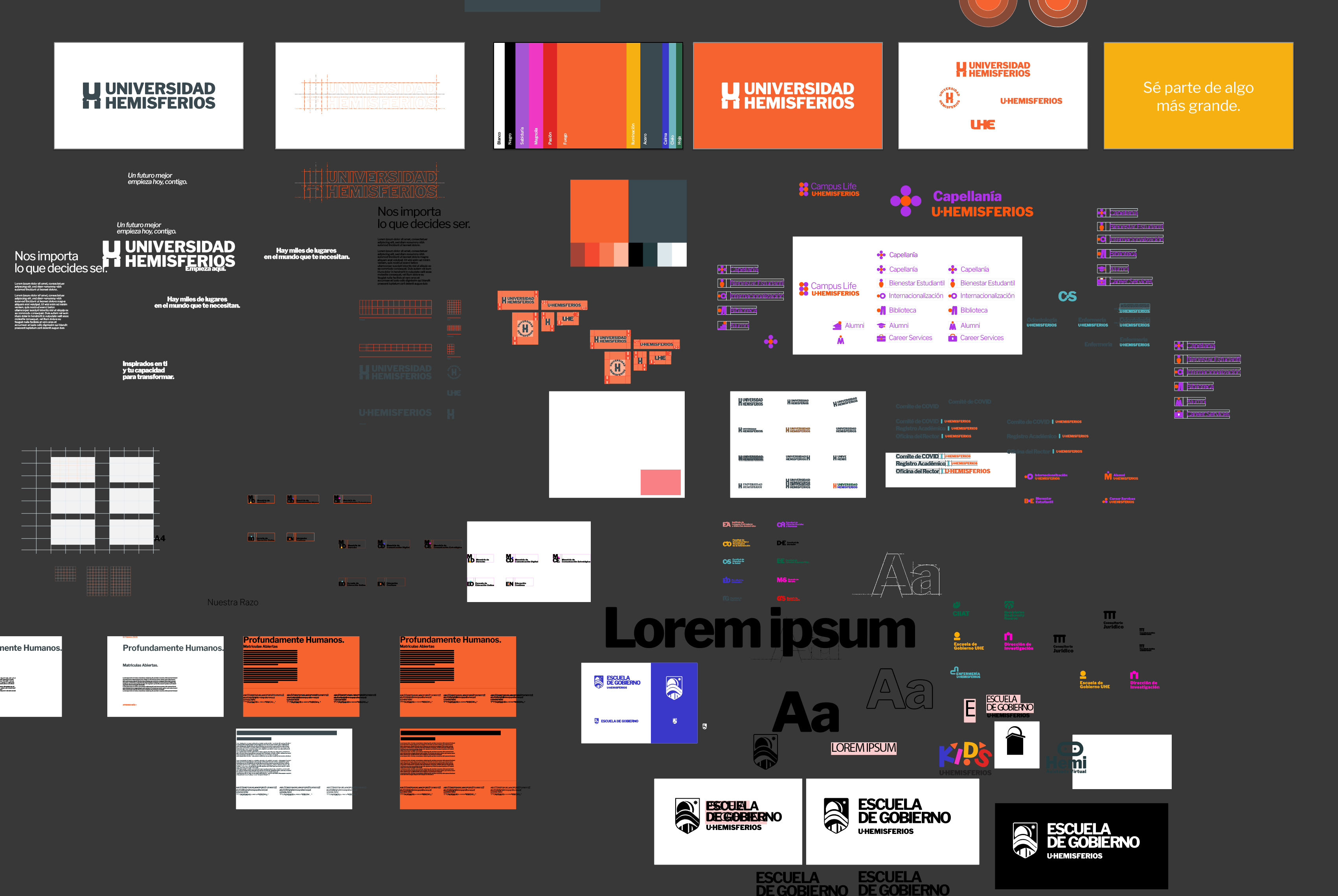
We created an icon system that helped structure the different campus services under the same logic. We named and organized the departments using initials and color codes. In addition, we created sub-brands such as the university soccer team and the School of Government, which has its own logo but was created under the same pillar concept.
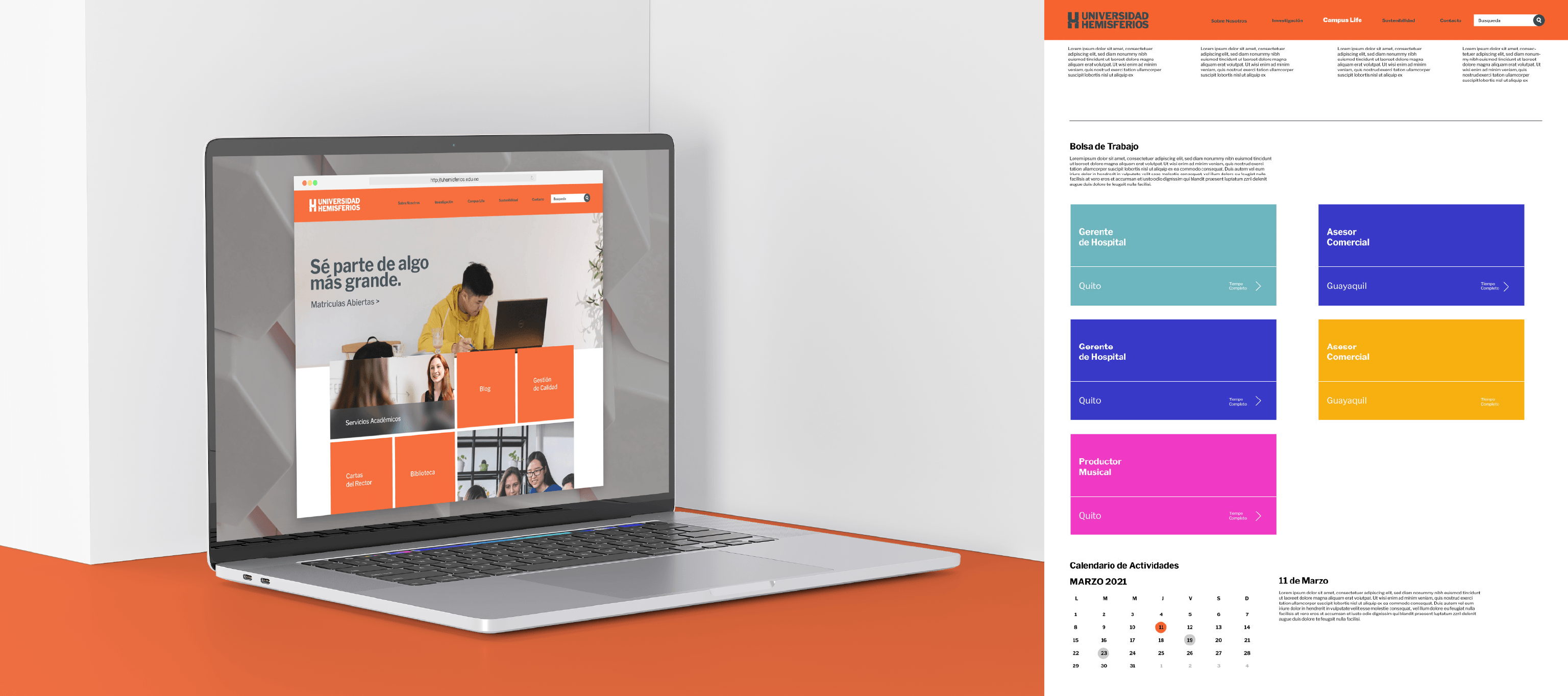
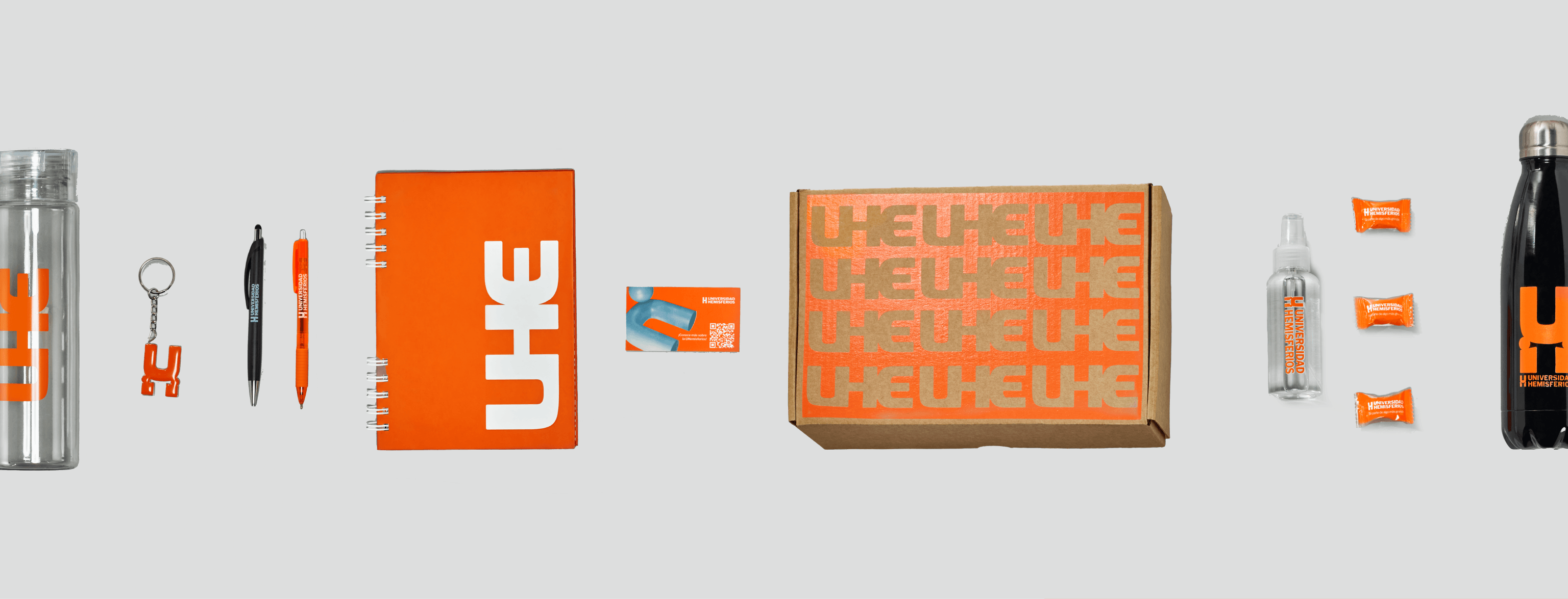
To rebrand a brand that is this large and has such a history, it is important to recognize and restructure what has already been built, integrating it into what you want to build for the future with a clear vision. In the end, we delivered a complete project that covered everything from signage and wayfinding to music and audiovisual resources for the university's use.
When a brand is large and lacks clear communication guidelines, it is only a matter of time before it feels disorganized. It is not the brand's fault; if I have 5 departments with different communication needs and I give them the same elements without clear instructions on how to apply them, each one will apply them differently.
When Universidad Hemisferios came to us, we were able to identify some common problems: disorganization in graphics and communication, sub-brands that did not connect with each other or the parent brand, and highly dissonant brand perceptions among different audiences.
As it was a large and complex project, we proposed its rebranding in 3 parts: